Закругленные углы таблиц css
Источник http://codingtools.ru/lessons/2/109 Обратил внимание со стильным дизайном.
Существуют некие дискуссии о том, когда и как использовать таблицы в веб-разработке. Вывод один: когда мы имеем дело с табличными данными, таблицы просто необходимы.
Проектирование дизайна таблицы всегда является сложной задачей. Если ваша таблица трудно сканируется взглядом, как правило, раздражает пользователей, они теряют фокус и путаются в столбцах и строках.
Сегодня мы создадим красивую таблицу с иcпользованием CSS3. Так же будем использовать jQuery для совместимости с некоторыми браузерами.
И что хорошего в оформлении этих таблиц?
Здесь вы увидите, как можно совмещать CSS3 и таблицы, для того, что бы получить полезный и красивый результат.
- закругленные углы без использования изображений
- легкость обновления — нет дополнительных CSS идентификаторов и классов
- удобно и легко читается.
Закругленные углы таблицы
Используем трюк: в то время как свойство border-collapse и имеет значение separate, нужно установить для свойства border-spacing значение 0.
Для IE7 и ниже нам необходимо добавить специальную строку, для обеспечения совместимости вывода таблицы.
Затем нам просто нужно закруглить некоторые углы:
Обратная совместимость с использованием jQuery
Возможно Вы уже знаете, что когда речь идет о IE6, то :hover работает только для элементов ссылок.
вы можете использовать решение на jQuery для имитации эффекта при наведении:
А вот стиль для класса highlight, который используется в JavaScript коде:
Для создания эффекта зебры, используя CSS3, выбираем четные строки в tbody.
Выше приведенный CSS3-селектор не поддерживается в старых браузерах. Ниже приведен jQuery-код, который позволит добиться эффекта зебры во всех браузерах:
А также стиль класса для JavaScript кода:
Пракическая реализация. создайте файлик *.html с кодом ниже и будет результат
body width: 600px;
margin: 40px auto;
font-family: ‘trebuchet MS’, ‘Lucida sans’, Arial;
font-size: 14px;
color: #444;
>
table *border-collapse: collapse; /* Для IE7 и меньше */
border-spacing: 0;
width: 100%;
>
.bordered border: solid #ccc 1px;
-moz-border-radius: 6px;
-webkit-border-radius: 6px;
border-radius: 6px;
-webkit-box-shadow: 0 1px 1px #ccc;
-moz-box-shadow: 0 1px 1px #ccc;
box-shadow: 0 1px 1px #ccc;
>
.bordered tr:hover background: #fbf8e9;
-o-transition: all 0.1s ease-in-out;
-webkit-transition: all 0.1s ease-in-out;
-moz-transition: all 0.1s ease-in-out;
-ms-transition: all 0.1s ease-in-out;
transition: all 0.1s ease-in-out;
>
.bordered td, .bordered th border-left: 1px solid #ccc;
border-top: 1px solid #ccc;
padding: 10px;
text-align: left;
>
.bordered th background-color: #dce9f9;
background-image: -webkit-gradient(linear, left top, left bottom, from(#ebf3fc), to(#dce9f9));
background-image: -webkit-linear-gradient(top, #ebf3fc, #dce9f9);
background-image: -moz-linear-gradient(top, #ebf3fc, #dce9f9);
background-image: -ms-linear-gradient(top, #ebf3fc, #dce9f9);
background-image: -o-linear-gradient(top, #ebf3fc, #dce9f9);
background-image: linear-gradient(top, #ebf3fc, #dce9f9);
-webkit-box-shadow: 0 1px 0 rgba(255,255,255,.8) inset;
-moz-box-shadow:0 1px 0 rgba(255,255,255,.8) inset;
box-shadow: 0 1px 0 rgba(255,255,255,.8) inset;
border-top: none;
text-shadow: 0 1px 0 rgba(255,255,255,.5);
>
.bordered td:first-child, .bordered th:first-child border-left: none;
>
.bordered th:first-child -moz-border-radius: 6px 0 0 0;
-webkit-border-radius: 6px 0 0 0;
border-radius: 6px 0 0 0;
>
.bordered th:last-child -moz-border-radius: 0 6px 0 0;
-webkit-border-radius: 0 6px 0 0;
border-radius: 0 6px 0 0;
>
.bordered tr:last-child td:first-child -moz-border-radius: 0 0 0 6px;
-webkit-border-radius: 0 0 0 6px;
border-radius: 0 0 0 6px;
>
.bordered tr:last-child td:last-child -moz-border-radius: 0 0 6px 0;
-webkit-border-radius: 0 0 6px 0;
border-radius: 0 0 6px 0;
>
.zebra td, .zebra th padding: 10px;
border-bottom: 1px solid #f2f2f2;
>
.zebra tbody tr:nth-child(even) background: #f5f5f5;
-webkit-box-shadow: 0 1px 0 rgba(255,255,255,.8) inset;
-moz-box-shadow:0 1px 0 rgba(255,255,255,.8) inset;
box-shadow: 0 1px 0 rgba(255,255,255,.8) inset;
>
.zebra th text-align: left;
text-shadow: 0 1px 0 rgba(255,255,255,.5);
border-bottom: 1px solid #ccc;
background-color: #eee;
background-image: -webkit-gradient(linear, left top, left bottom, from(#f5f5f5), to(#eee));
background-image: -webkit-linear-gradient(top, #f5f5f5, #eee);
background-image: -moz-linear-gradient(top, #f5f5f5, #eee);
background-image: -ms-linear-gradient(top, #f5f5f5, #eee);
background-image: -o-linear-gradient(top, #f5f5f5, #eee);
background-image: linear-gradient(top, #f5f5f5, #eee);
>
.zebra th:first-child -moz-border-radius: 6px 0 0 0;
-webkit-border-radius: 6px 0 0 0;
border-radius: 6px 0 0 0;
>
.zebra th:last-child -moz-border-radius: 0 6px 0 0;
-webkit-border-radius: 0 6px 0 0;
border-radius: 0 6px 0 0;
>
.zebra tfoot td border-bottom: 0;
border-top: 1px solid #fff;
background-color: #f1f1f1;
>
.zebra tfoot td:first-child -moz-border-radius: 0 0 0 6px;
-webkit-border-radius: 0 0 0 6px;
border-radius: 0 0 0 6px;
>
.zebra tfoot td:last-child -moz-border-radius: 0 0 6px 0;
-webkit-border-radius: 0 0 6px 0;
border-radius: 0 0 6px 0;
>
CSS Rounded Table Corners
Let’s assume you have a website theme that requires having rounded corners for elements including tables. Let’s see how we can achieve them and what are the challenges in achieving so.
Let’s create a simple table.
Name Department Office John Admin North Smith Logistics South David Transport East
Let’s add some basic styling to it using background-color , color , and padding properties. We also remove the spacing between the internal borders using border-spacing: 0 (not by using border-collapse — this is important for out rounded corners).
| Name | Department | Office |
|---|---|---|
| John | Admin | North |
| Smith | Logistics | South |
| David | Transport | East |
Rounding The Outer Corners
Let’s next add a border-radius to get our rounded corners.
table.rounded-corners < border-spacing: 0; border-collapse: separate; border-radius: 10px; >table.rounded-corners th, table.rounded-corners td
Whoa, the corners didn’t get rounded! Well, the corners of the background got rounded, but not the border. This is because the borders of the table cells didn’t get rounded — they stayed square. Lets take a look if we applied the border to the outside of the table, and removed it from the individual cells:
Now all we need to do is add back the internal borders, but not round the outside edges of the cells. If you take another look at the previous tables, you will also see that the interal borders are 2px wide. This is because we are using border-collapse: separate which means each cell has its own 1px border, which touches the 1px border from the next cell. Unfortunately we can’t just set the border width to 0.5px. However, we can rely on the content model of the table to help us construct some funky selectors that will work for all tables. The following snippet will work for any well-structured table, including tables with captions, colgroups, tbody, no tbody etc.
table.rounded-corners < border-spacing: 0; border-collapse: separate; border-radius: 10px; border: 1px solid black; >/* Apply a border to the right of all but the last column */ table.rounded-corners th:not(:last-child), table.rounded-corners td:not(:last-child) < border-right: 1px solid black; >/* Apply a border to the bottom of all but the last row */ table.rounded-corners>thead>tr:not(:last-child)>th, table.rounded-corners>thead>tr:not(:last-child)>td, table.rounded-corners>tbody>tr:not(:last-child)>th, table.rounded-corners>tbody>tr:not(:last-child)>td, table.rounded-corners>tfoot>tr:not(:last-child)>th, table.rounded-corners>tfoot>tr:not(:last-child)>td, table.rounded-corners>tr:not(:last-child)>td, table.rounded-corners>tr:not(:last-child)>th, table.rounded-corners>thead:not(:last-child), table.rounded-corners>tbody:not(:last-child), table.rounded-corners>tfoot:not(:last-child)
This is starting to look good now. You could probably stop there if that’s all you need. If you want to style the backgrounds of individual cells or rows (e.g. alternating colors or highlighting rows on hover) then we’ll sort that out first. Lets just change the background color of our header row to something really nice to make it stand out:
And we just broke our nice rounded corners again. Remember we didn’t round the corners of the individual cells, just the table itself. Thankfully, although the fix was a little bit tricky for the borders, it’s much easier for the background. We can just set the overflow on the whole table to hidden to hide the bit that sticks out over the rounded corners. We’ve used a CSS variable here just to remove the duplication on the border style.
table.rounded-corners < /* Change these properties */ --border: 1px solid black; border-radius: 10px; /* Don't change these properties */ border-spacing: 0; border-collapse: separate; border: var(--border); overflow: hidden; >/* Apply a border to the right of all but the last column */ table.rounded-corners th:not(:last-child), table.rounded-corners td:not(:last-child) < border-right: var(--border); >/* Apply a border to the bottom of all but the last row */ table.rounded-corners>thead>tr:not(:last-child)>th, table.rounded-corners>thead>tr:not(:last-child)>td, table.rounded-corners>tbody>tr:not(:last-child)>th, table.rounded-corners>tbody>tr:not(:last-child)>td, table.rounded-corners>tfoot>tr:not(:last-child)>th, table.rounded-corners>tfoot>tr:not(:last-child)>td, table.rounded-corners>tr:not(:last-child)>td, table.rounded-corners>tr:not(:last-child)>th, table.rounded-corners>thead:not(:last-child), table.rounded-corners>tbody:not(:last-child), table.rounded-corners>tfoot:not(:last-child)
And there we have it. We now have our rounded table corners with an easy copy/paste snippet
Rounding Internal Corners
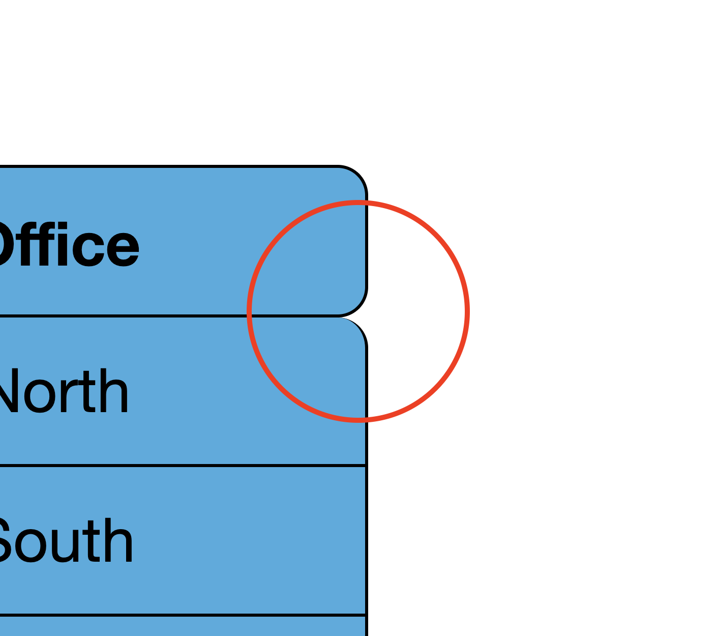
While the above works great if all you want to do is round the outer 4 corners of the table, it doesn’t work so well if you want to round any of the other corners. Lets say, for example, you wanted to round the corners of the table headings so it looks separate from the body. If we use the previous trick using overflow: hidden , then the background will show outside the rounded corners between the heading and the body. We can easily fix this by applying the background to the individual cells, but we now have the problem of actually creating the border around these rounded corners. We can apply the border to the individual cells, but then we get the minimum 2px internal borders. If we just apply the border to one side of each cell boundary, then we lose part of the border on the internal rounded corners:
| Name | Department | Office |
|---|---|---|
| John | Admin | North |
| Smith | Logistics | South |
| David | Transport | East |
It almost works perfectly, apart from these bits here:
Box Shadow To The Rescue
Instead of using borders, we can use a little trick involving a box-shadow on every cell to create the effect that we’re after. It actually makes our border code surprisingly simple:
table.rounded-corners < /* We need this to be able to use border-radius. */ border-collapse: separate; /* Add a 1px border spacing for out box-shadow to fit into. Increase this if you want to increase the border width. */ border-spacing: 1px; >table.rounded-corners th, table.rounded-corners td < /* Remove any borders from our stylesheet. */ border: 0; /* Use the spread value on the box-shadow to set the border width. */ box-shadow: 0 0 0 1px black; > Now we can style the rest of the cells and round their corners as much as we want:
table.rounded-corners thead tr:first-child th:first-child < border-top-left-radius: 10px; >table.rounded-corners thead tr:last-child th:first-child < border-bottom-left-radius: 10px; >table.rounded-corners thead tr:first-child th:last-child < border-top-right-radius: 10px; >table.rounded-corners thead tr:last-child th:last-child < border-bottom-right-radius: 10px; >table.rounded-corners tbody tr:first-child td:first-child < border-top-left-radius: 10px; >table.rounded-corners tbody tr:last-child td:first-child < border-bottom-left-radius: 10px; >table.rounded-corners tbody tr:first-child td:last-child < border-top-right-radius: 10px; >table.rounded-corners tbody tr:last-child td:last-child
And the results are just right
| Name | Department | Office |
|---|---|---|
| John | Admin | North |
| Smith | Logistics | South |
| David | Transport | East |
Conclusion
Rounding the corners of a table appears to be a simple task but it can easily get tricky based on your requirements. If you are only rounding the corners of the whole table, a border-radius will get the job done. But if you need to round the header and body separately, or even round the individual table rows in the body, then you can get the job done with a box-shadow .
UnusedCSS helps website owners remove their unused CSS every day. Sign Up to see how much you could remove.
You Might Also Be Interested In