- Skeleton Screen Loading Animation using HTML & CSS
- Step 1: Design the web page
- Step 2: Basic structure of Skeleton Loading
- Step 3: Add profile image and cover image
- Step 4: Add basic information to the card
- Step 5: Create contact button
- Step 5: Add Loading Effect to images
- Step 6: Add Loading Effect to the information
- Step 7: Turn off Skeleton Loading Effect using JavaScript
- 10 CSS Skeleton Loadings
- Author
- Links
- Made with
- About a code
- Loading Card
- Author
- Links
- Made with
- About a code
- CSS Skeleton
- Author
- Links
- Made with
- About a code
- Skeleton Loading Using Only a Few Lines of CSS
- Author
- Links
- Made with
- About a code
- Movies Skeleton Loading
- Author
- Links
- Made with
- About a code
- CSS Skeleton Loader Animation
- Author
- Links
- Made with
- About a code
- Pure CSS Skeleton Loading Animation With Shimmer
- Author
- Links
- Made with
- About a code
- CSS Grid Card Skeleton Screen with Custom Properties
- Author
- Links
- Made with
- About a code
- Card Skeleton Loader
- Author
- Links
- Made with
- About a code
- Card UI Skeleton Screen
- Author
Skeleton Screen Loading Animation using HTML & CSS
In this article I have shown how Skeleton Screen Loading Animation is created using HTML CSS and JavaScript. I created this animation on a profile card. You will see various websites where you can see Skeleton Loading Animation before loading any element. Undoubtedly it enhances the quality and beauty of the website a lot. You need to have a basic idea about HTML and CSS to make it. ✅ Watch Live Preview 👉👉 Skeleton Screen Loading Animation I have shown this kind of effect before but it was not effective. In this case I have used JavaScript to make it work. This Skeleton Screen Loading Animation will continue for three seconds when you open the web page. After three seconds this effect is off and all the information on the profile card can be seen.
Step 1: Design the web page
To create this animation, I first designed the webpage with CSS code. Here I have used light blue as the background color of the web page.
* box-sizing: border-box; margin: 0; padding: 0; > body display: flex; align-items: center; justify-content: center; height: 100vh; background: #eff7f2; font-family: "Lato", sans-serif; > 
Step 2: Basic structure of Skeleton Loading
Now I have created the basic structure of this Skeleton Loading Animation or Profile Card. I have used the width: 300px and height: 400px of this profile card. A shadow has been used around the card to enhance the beauty.
.user-card width: 300px; height: 400px; box-shadow: -10px 5px 20px rgba(0, 0, 0, 0.3); border-radius: 15px; overflow: hidden; background: white; display: flex; flex-direction: column; align-items: center; justify-content: space-between; transition: box-shadow 0.2s ease-in; cursor: pointer; > .user-card:hover box-shadow: -10px 10px 20px rgba(0, 0, 0, 0.4); > 
Step 3: Add profile image and cover image
Now I have added profile image and cover image in profile card. I have used the width and height of the profile image 100 px. I used border-radius: 50% to make it completely round. I have added a cover image with height: 150px and width: 100%.
class="user-cover"> class="user-avatar" src="img.jpg" alt="user profile image" /> .user-card .user-cover height: 150px; width: 100%; position: relative; background-image: url(img1.jpg); background-position: center; background-size: cover; > .user-card .user-cover .user-avatar position: absolute; width: 100px; height: 100px; border-radius: 50%; left: 0; right: 0; margin: auto; bottom: -35px; border: 2px solid #fff; > 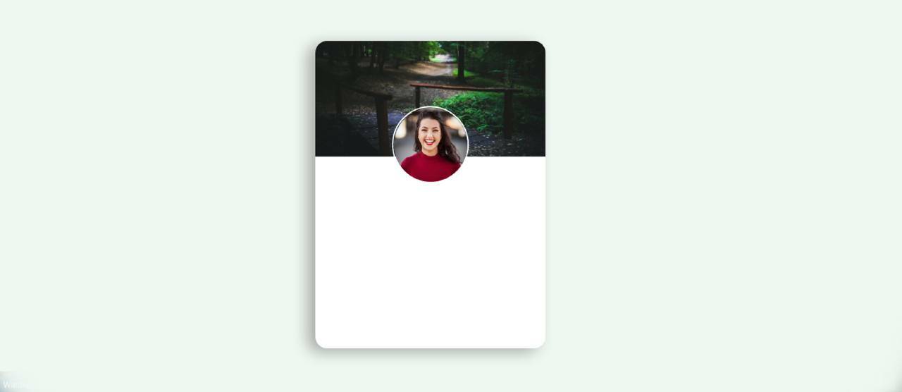
Step 4: Add basic information to the card
Now I have added some basic information in this Skeleton Screen Loading Animation or Profile Card. I used margin-top: 35px to keep all the information from top to bottom.
class="user-details"> class="user-name hide-text">Anamika Roy class="user-email hide-text">Web Designer class="user-text hide-text">Lorem ipsum . consectetur. .user-card .user-details text-align: center; margin-top: 35px; margin-bottom: 25px; width: 80%; > .user-card .user-details .user-name margin-bottom: 10px; font-size: 24px; font-weight: 600; > .user-card .user-details .user-email font-size: 14px; color: #0f5fc0; font-weight: 500; > .user-card .user-details .user-text margin-top: 5px; font-size: 15px; color: #666; > 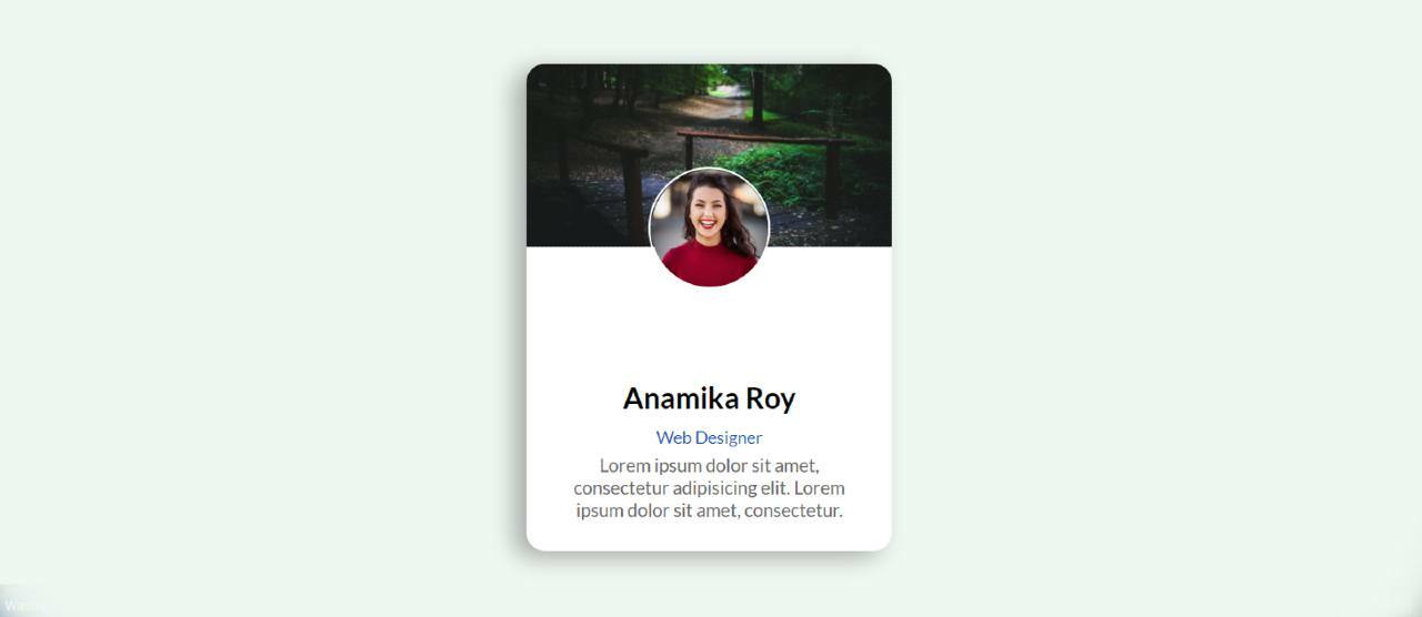
Step 5: Create contact button
Now I have added a contact button in it. I have used the button height: 35px , width 60% and background color blue. I have used font-weight: bold to increase the size of the text.
class="contact-user hide-text">CONTACT .user-card .contact-user margin-bottom: 15px; height: 35px; width: 80%; border: 0; color: white; font-weight: bold; background: #035f7d; letter-spacing: 0.5px; border-radius: 5px; cursor: pointer; > 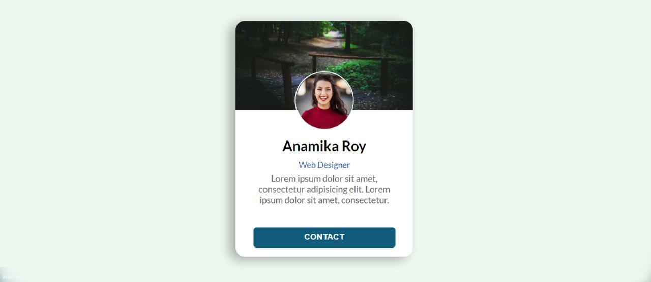
Step 5: Add Loading Effect to images
First I added animation between the profile image and the cover image. However, there is no animation in the image, only I have used gray color in the background. The way I designed the profile image and the cover image is the same way I designed it here.
.user-card.skeleton .user-cover background: #e2e2e2; > .user-card.skeleton .user-cover .user-avatar display: none; > .user-card.skeleton .user-cover::after content: ""; position: absolute; width: 100px; height: 100px; border-radius: 50%; left: 0; right: 0; margin: auto; bottom: -35px; border: 2px solid #fff; z-index: 10; background: #e2e2e2; > 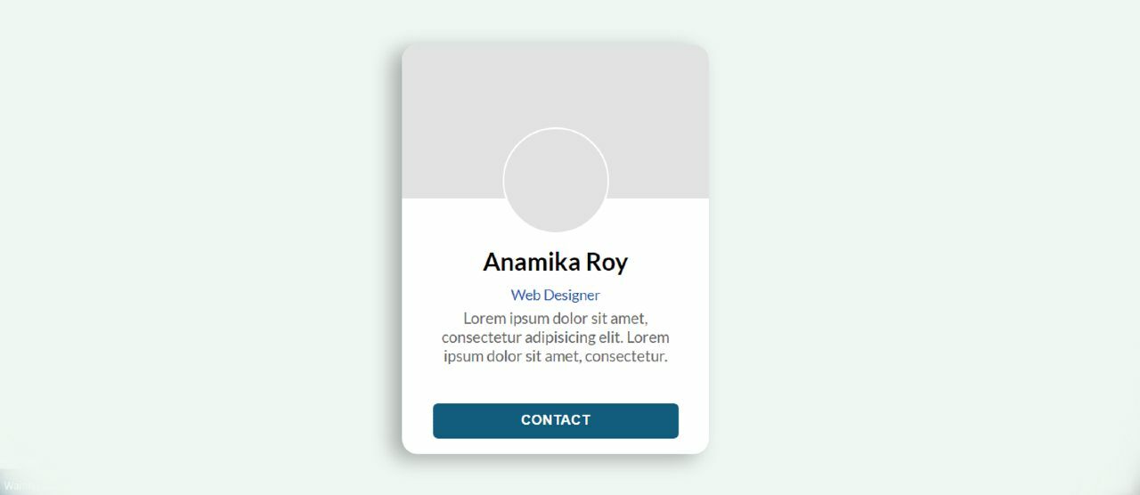
Step 6: Add Loading Effect to the information
Now I have added animation and color between the text and the button. First I added colors to the buttons and texts, then I added animations using @keyframes . ✅ Related Post 👉👉 Transparent Login Form animation-duration: 2s used to help make this animation work every two seconds. Here animation means a black shadow will continue to travel from left to right every 2 seconds.
.user-card.skeleton .hide-text background: #e2e2e2; color: transparent; position: relative; overflow: hidden; > .user-card.skeleton .hide-text::before content: ""; position: absolute; left: 0%; top: 0; height: 100%; width: 50px; background: linear-gradient(to right, #e2e2e2 25%, #d5d5d5 50%, #e2e2e2 100%); animation-name: gradient-animation; animation-duration: 2s; animation-iteration-count: infinite; filter: blur(5px); > @keyframes gradient-animation from left: 0%; > to left: 100%; > > 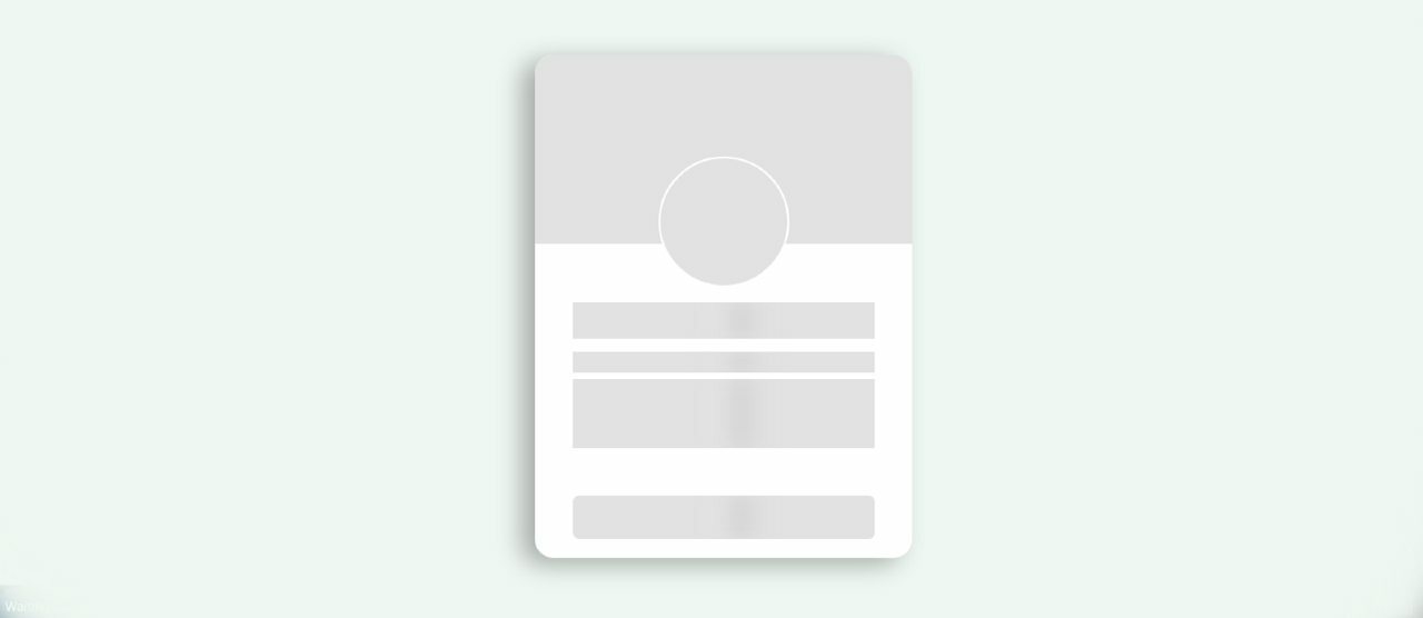
Step 7: Turn off Skeleton Loading Effect using JavaScript
Now the most important thing is to turn off the animation using JavaScript. Above we have added Skeleton Screen Loading Animation using css. This animation will continue indefinitely. So now after some time using JavaScript you have to turn off that animation and instruct to view all the information in the profile card. I set the time to 3000 milliseconds using setTimeout . That means after 3000 milliseconds that gray color animation will be hidden.
If you want to use 4 seconds instead of these 3 seconds then you have to use 4000 instead of 3000 here.
const $el = document.querySelector(".user-card"); // Loading finished setTimeout(() => $el.classList.remove("skeleton"); $el .querySelectorAll(".hide-text") .forEach((el) => el.classList.remove("hide-text")); >, 3000); 
Related Post:
- Simple Footer HTML CSS
- Make a Todo List using JavaScript
- Simple Stopwatch using JavaScript
- Javascript Age Calculator
- Random Password Generator with JavaScript
- Automatic Image Slider in Html, CSS
- Sidebar Menu Using HTML CSS
Hope you learned from this tutorial how to create Skeleton Loading Animation using HTML CSS and JavaScript. I have already shared many more such tutorials, you can see those designs.
10 CSS Skeleton Loadings
Collection of free HTML and CSS skeleton loading examples from codepen and other resources.
Author
Links
Made with
About a code
Loading Card
Compatible browsers: Chrome, Edge, Firefox, Opera, Safari
Author
Links
Made with
About a code
CSS Skeleton
Compatible browsers: Chrome, Edge, Firefox, Opera, Safari
Author
Links
Made with
About a code
Skeleton Loading Using Only a Few Lines of CSS
Compatible browsers: Chrome, Edge, Firefox, Opera, Safari
Author
Links
Made with
About a code
Movies Skeleton Loading
Loading movies images, title and subtitle and book now button in a skeleton loading pattern.
Compatible browsers: Chrome, Edge, Firefox, Opera, Safari
Author
Links
Made with
About a code
CSS Skeleton Loader Animation
Simple skeleton loader animation using HTML & CSS.
Compatible browsers: Chrome, Edge, Firefox, Opera, Safari
Author
Links
Made with
About a code
Pure CSS Skeleton Loading Animation With Shimmer
Improve perceived performance with a fancy skeleton loading animation.
Compatible browsers: Chrome, Edge, Firefox, Opera, Safari
Author
Links
Made with
About a code
CSS Grid Card Skeleton Screen with Custom Properties
The skeleton page is a big trend in UX field. Using CSS Grid to create the page layout, it is more practical to work with components that need to be dynamically repeated.
Compatible browsers: Chrome, Edge, Firefox, Opera, Safari
Author
Links
Made with
About a code
Card Skeleton Loader
Compatible browsers: Chrome, Edge, Firefox, Opera, Safari
Author
Links
Made with
About a code
Card UI Skeleton Screen
This creates a skeleton of a card component using CSS custom properties to draw different gradients on the background-image . Skeleton screens can be used to improve perceived performance while loading.
Compatible browsers: Chrome, Edge, Firefox, Opera, Safari