Introduction
With QSM Update(v7.2.0) Quiz and Survey Master have introduced 4 New Beautiful Premium themes that will change the look and feel of your quiz and survey.
These new themes will enhance the already robust QSM quizzes and surveys to create a visual appearance that will complement the quiz it is being used on and put the users in awe and make them take the quiz.
You will now have the opportunity to use these themes in your newly created quizzes by updating the QSM Core Plugin to v7.2.0 from any of the lower versions and purchasing them.
How to use the New Themes Feature?
To take the benefit of the newly introduced themes for the QSM Plugin. You first need to have purchased the required themes.
After purchasing the theme, You will have to start by creating a New Quiz by navigating to the QSM Dashboard or the Quizzes/Surveys Section.
Now, you will be greeted with a new Quiz Setup Wizard that lets you set basic initial configurations to start with creating a new Quiz/Survey/Form. Creating a Quiz Template.
Select Themes

The very first Tab is that of “Select Themes”, here you see your downloaded themes and can also download new themes. As you haven’t downloaded any new themes, you will only see the Default Theme card.
To download the new QSM themes you will need to hit “Browse Themes” and choose the themes you need and download it to your QSM Plugin. Following are the new themes that you can download:
Each of these new themes has the option to set a Featured Image that will be displayed at the beginning of the quiz along with the Quiz Name. Also, you will have the option to customize the quiz appearance by changing the colors of the various visual elements while configuring the quiz in the “Style Tab”.
Quiz Settings

After downloading and selecting the preferred theme, hit the “Next” button. Now in the “Quiz Setting” tab enter initial quiz details, note that Quiz Settings are relative to the Form Type you choose:
- Quiz Name – Enter the Name of the Quiz
- Quiz Featured Image – Set a Featured Image to display to the quiz takers before commencing the Quiz.
- Form Type – Choose what type of for you want to create. i.e. Quiz, Survey, or a Simple Form
- Graded System – Specify whether you want the quiz to be of graded type. i.e. Correct/Incorrect type, Points System, or both. You can set Grading System only while creating a Quiz.
- Questions Per Page – Specify the number of questions you want to display on a page. By default, you can display a single question.
- Show Progress Bar – Specify whether you want to display a Progress Bar to the user while attempting the quiz.
- Time Limit (in Minute) – Specify the time limit of the Quiz in the number of minutes if you want to create a timed quiz. If you don’t want the timer function you can let the value remain 0 which is the default value.
- Show current page number – You can let the users know of their current page number and also the total number of pages a quiz has.
- Require User Login – You can limit the quiz to only for the logged-in users, by enabling the required user login option.
After specifying the details you can save the settings and move to the next tab by clicking the “Next” button.
Addons
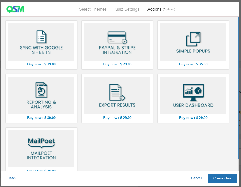
In the Addons tab, you can browse various QSM Premium Addons that club with the QSM Core Plugin to boost the Quiz Plugin thus benefiting you and allowing you to make the utmost use of the collected data and use it for multiple purposes.
Quiz and Survey Master has 40+ Addons that can be purchased separately or as a whole. You can check out all the Popular Addons, On Sale Addons, and Recently Updated Addons in the Addons Tab of the Quiz Setup Wizard. Or click the Browse All Addons link to view all the QSM Addons and their uses.
Adding addons is an optional step and can be skipped. You can however purchase the Addons as Bundle later on.
After you’re done setting the quiz hit the “Create Quiz” Button allowing you to further configure the quiz by adding Question and Answers, Creating a Contact Form, Displaying Custom Messages, Configuring the Quiz Behaviour, Setting up Admin and User Emails, Configuring the Results Page and Styling the Quiz by customizing the Theme to match the appearance of your website’s color scheme.
QSM Style Tab

The new QSM v7.2.0 adds more functionality to the QSM’s Style Tab. With the advent of QSM Themes there a lot happening in the Style Tab.
If you have purchased and installed any of the new QSM Themes other than the default theme you can find the themes in the “My Themes” section and customize the activated theme even further.
You can even change the theme and activate a theme of your choice for a particular quiz.
In the “Premium Themes” menu you can purchase new premium themes as and when they are released.
You can change the Featured Image that you had set while creating a quiz to a new Image from the Style Tab.
Note: Featured Image only works with the New QSM Themes, the option of setting a featured image will disappear if you are on the default QSM Theme.
Keep in mind that each QSM theme has its own set of customization options that you can use. Things like changing the background color, button color, font color to any color of your choice. Following are the list of Theme options that you can customize:
Breeze Theme
- Background Color
- Button Color
- Progressbar Color
- Option Hover Color
- Font Color
Fragrance Theme
- Background Color
- Button Color
- Progressbar Color
- Option Hover Color
- Font Color
Ivory Theme
- Background Color
- Button Color
- Progressbar Color
- Option Hover Color
- Font Color
Pool Theme
- Background Color
- Button Color
- Progressbar Color
- Progressbar Background Color
- Option Hover Color
- Font Color
According to the theme you’ve activated, you can customize their corresponding options.
The option to add custom CSS is still intact and you can add your CSS Styles to beautify the quiz according to your preference. You can find more information on QSM CSS Styles Editing.
Also, for legacy users using the default QSM theme, we have kept the “Choose your style:” option consisting of 5 color styles. However, we recommend you to use the new QSM Themes as we will soon remove the Legacy Style feature for the default QSM Theme.
Editing Design Styles (CSS)
After Setting up your Quiz and before making it live, its time to enhance the appearance of the Quiz from the Style Tab.

To beautify your Quiz/Survey you can choose between various Styles already made available in the Style Tab. Some of the predefined styles include Primary(Blue Color), Amethyst(Purple Color), Emerald(Green Color), Turquoise(Blue-Green Color), Gray, and Custom Style.
With the predefined Color Styles, the effect can be seen on the Contact Form Fields and the Navigation Buttons. If you want to further enhance the appearance and add something of your own you can do that by choosing the custom style option of the Style Tab and Saving the Quiz Style.
The “Custom Style CSS” replaces all CSS for a particular quiz or survey. If you choose “Custom” as the style, you can create a custom design using the “Custom Style CSS” text box on the “Style” tab. However, none of the default QSM styles will be loaded if you’re using that option.
To add Custom CSS Styles you have to enter your CSS code into the blank text box and hit the Save Quiz Style Button after successfully adding the code.
Sample Set of CSS Classes
‘qsm-quiz-container’ – class for the div element that wraps the entire quiz‘qsm-quiz-form’ – class for the form element of the quiz‘qsm-error-message’ – class for the error message that appears when certain fields are required or when certain answers do not pass validation (i.e. email fields not containing emails)‘qsm-page’ – class for each “page” of the quiz or survey. NOTE: If the quiz or survey uses the “questions per page” option, this page element is not used‘qsm-before-message’ – class on the div element of the text that is shown before the quiz which can be customized on the “Text” tab.‘qsm_contact_div’ – class on the div element that wraps each contact field.‘qsm-contact-type-text’ – additional class on the div element that wraps each contact field that designates the type of contact field.Other CSS Classes
‘mlw_qmn_quiz‘ – class for the entire quiz‘mlw_quiz_form’ – class for form‘quiz_section’ – class for each quiz page‘mlw_qmn_message_before’ – class for message before text‘mlw_qmn_question’ – class for question text‘qmn_error’ – class for error messages‘mlw_qmn_question_comment’ – class for comment fields‘mlw_qmn_comment_section_text’ – class for message for comment section‘mlw_qmn_message_end’ – class for message end text‘mlw_qmn_quiz_link’ – class for pagination buttons (Next/Previous)‘mlw_qmn_timer’ – class for the timer‘mlw_horizontal_multiple’ – class for horizontal multiple response answers‘mlw_answer_open_text’ – class for open answer question types‘mlw_answer_number’ – class for number question types‘mlw_qmn_hint_link’ – class for hint‘qmn_radio_answers’ – class for multiple choice answers‘qmn_quiz_radio’ – class for radio inputs‘mlw_horizontal_choice’ – class for horizontal multiple choice answers‘qmn_check_answers’ – class for multiple response answers‘qmn_page_counter_message’ – class for the pagination numbersEditing Design Styles (CSS)
Quiz And Survey Master has a few built-in “styles” to choose from. However, if you know CSS, you can customize the design of your quizzes and surveys. There are a few ways you can customize CSS:
- Using the “Custom Style CSS” on the “Style” tab
- Adding CSS to the “Additional CSS” in the Customizer
- Adding CSS to your theme
If you only want to make small style changes to all of your quizzes or surveys, your best option is to use the Customizer or your theme’s style.css.
The “Custom Style CSS” replaces all CSS for a particular quiz or survey. If you choose “Custom” as the style, you can create a custom design using the “Custom Style CSS” text box on the “Style” tab. However, none of the default QSM styles will be loaded if using that option.
For CSS, this plugin has gone through many transitions. This plugin was originally built as a side project of “My Local Webstop” so the classes originally looked like mlw_element. Then, the project was spun out so classes began using “qmn_element”. Eventually, we changed the name and started using a newer format of “qsm-element”.
For backward compatibility, we left the various classes on the elements but you should always choose the “qsm-element” formatted class as the others will eventually be removed.
Sample Set of CSS Classes used
‘qsm-quiz-container’ – class for the div element that wraps the entire quiz
‘qsm-quiz-form’ – class for the form element of the quiz
‘qsm-error-message’ – class for the error message that appears when certain fields are required or when certain answers do not pass validation (i.e. email fields not containing emails)
‘qsm-page’ – class for each “page” of the quiz or survey. NOTE: If the quiz or survey uses the “questions per page” option, this page element is not used
‘qsm-before-message’ – class on the div element of the text that is shown before the quiz which can be customized on the “Text” tab.
‘qsm_contact_div ‘ – class on the div element that wraps each contact field
‘qsm-contact-type-text’ – additional class on the div element that wraps each contact field that designates the type of contact field
Older CSS classes Used
‘mlw_qmn_quiz‘ – class for entire quiz
‘mlw_quiz_form’ – class for form
‘quiz_section’ – class for each quiz page
‘mlw_qmn_message_before’ – class for message before text
‘mlw_qmn_question’ – class for question text
‘qmn_error’ – class for error messages
‘mlw_qmn_question_comment’ – class for comment fields
‘mlw_qmn_comment_section_text’ – class for message for comment section
‘mlw_qmn_message_end’ – class for message end text
‘mlw_qmn_quiz_link’ – class for pagination buttons (Next/Previous)
‘mlw_qmn_timer’ – class for the timer
‘mlw_horizontal_multiple’ – class for horizontal multiple response answers
‘mlw_answer_open_text’ – class for open answer question types
‘mlw_answer_number’ – class for number question types
‘mlw_qmn_hint_link’ – class for hint
‘qmn_radio_answers’ – class for multiple choice answers
‘qmn_quiz_radio’ – class for radio inputs
‘mlw_horizontal_choice’ – class for horizontal multiple choice answers
‘qmn_check_answers’ – class for multiple response answers
‘qmn_page_counter_message’ – class for the pagination numbers