Как строить красивые графики на Python с Seaborn

Визуализация данных — это метод, который позволяет специалистам по анализу данных преобразовывать сырые данные в диаграммы и графики, которые несут ценную информацию. Диаграммы уменьшают сложность данных и делают более понятными для любого пользователя.
Есть множество инструментов для визуализации данных, таких как Tableau, Power BI, ChartBlocks и других, которые являются no-code инструментами. Они очень мощные, и у каждого своя аудитория. Однако для работы с сырыми данными, требующими обработки, а также в качестве песочницы, Python подойдет лучше всего.
Несмотря на то, что этот путь сложнее и требует умения программировать, Python позволит вам провести любые манипуляции, преобразования и визуализировать ваши данные. Он идеально подходит для специалистов по анализу данных.
Python — лучший инструмент для data science и этому много причин, но самая важная — это его экосистема библиотек. Для работы с данными в Python есть много замечательных библиотек, таких как numpy , pandas , matplotlib , tensorflow .
Matplotlib , вероятно, самая известная библиотека для построения графиков, которая доступна в Python и других языках программирования, таких как R. Именно ее уровень кастомизации и удобства в использовании ставит ее на первое место. Однако с некоторыми действиями и кастомизациями во время ее использования бывает справиться нелегко.
Разработчики создали новую библиотеку на основе matplotlib , которая называется seaborn . Seaborn такая же мощная, как и matplotlib , но в то же время предоставляет большую абстракцию для упрощения графиков и привносит некоторые уникальные функции.
В этой статье мы сосредоточимся на том, как работать с seaborn для создания первоклассных графиков. Если хотите, можете создать новый проект и повторить все шаги или просто обратиться к моему руководству по seaborn на GitHub.
Что такое Seaborn?
Seaborn — это библиотека для создания статистических графиков на Python. Она основывается на matplotlib и тесно взаимодействует со структурами данных pandas.
Архитектура Seaborn позволяет вам быстро изучить и понять свои данные. Seaborn захватывает целые фреймы данных или массивы, в которых содержатся все ваши данные, и выполняет все внутренние функции, нужные для семантического маппинга и статистической агрегации для преобразования данных в информативные графики.
Она абстрагирует сложность, позволяя вам проектировать графики в соответствии с вашими нуждами.
Установка Seaborn
Установить seaborn так же просто, как и любую другую библиотеку, для этого вам понадобится ваш любимый менеджер пакетов Python. Во время установки seaborn библиотека установит все зависимости, включая matplotlib , pandas , numpy и scipy .
Давайте уже установим seaborn и, конечно же, также пакет notebook , чтобы получить доступ к песочнице с данными.
pipenv install seaborn notebookПомимо этого, перед началом работы давайте импортируем несколько модулей.
import seaborn as sns import pandas as pd import numpy as np import matplotlibСтроим первые графики
Перед тем, как мы начнем строить графики, нам нужны данные. Прелесть seaborn в том, что он работает непосредственно с объектами dataframe из pandas , что делает ее очень удобной. Более того, библиотека поставляется с некоторыми встроенными наборами данных, которые можно использовать прямо из кода, и не загружать файлы вручную.
Давайте посмотрим, как это работает на наборе данных о рейсах самолетов.
flights_data = sns.load_dataset("flights") flights_data.head()Bar plot in seaborn
The following data will be used as sample data along this tutorial.
import numpy as np import seaborn as sns import random # Data simulation rng = np.random.RandomState(0) variable = rng.normal(20, 1, size = 50) random.seed(0) group = random.choices(["G1", "G2", "G3"], k = 50) group2 = random.choices(["A", "B"], k = 50) df =
Bar plot in seaborn with barplot
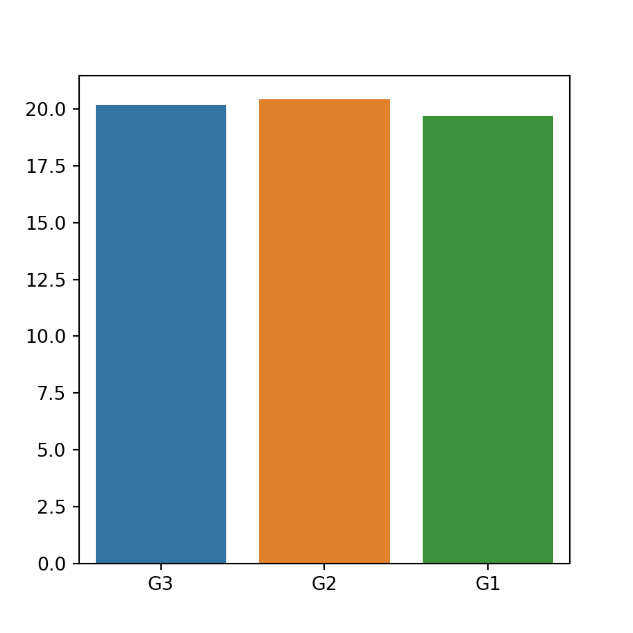
The barplot function allows creating bar charts in seaborn. This function computes the mean for each categorical variable and represents it with bars and its confidence interval with error bars. Use the countplot function to create a bar plot that displays the count for each category.
import seaborn as sns # Bar plot sns.barplot(x = group, y = variable) # Equivalent to: sns.barplot(x = "group", y = "variable", data = df)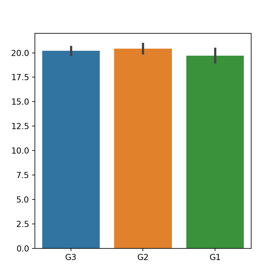
If you don’t want to use the mean you can pass other function to the estimator argument.
Horizontal bar plot
If you want to create an horizontal bar chart just switch the input variables and pass the categorical variable to y .
import seaborn as sns # Horizontal bar plot sns.barplot(x = variable, y = group)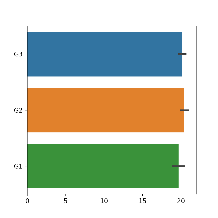
Note that the default order of the bars depends on the order of appearance of the groups on the variable. If you want to override the default order pass a list with the desired order to the order argument.
import seaborn as sns sns.barplot(x = group, y = variable, order = ["G1", "G2", "G3"])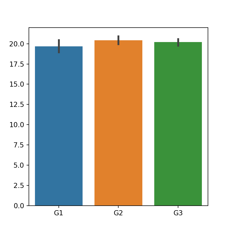
Dodged bar plot
If you have other categorical variable that divides the categories into subcategories you can pass it to the hue argument to create a dodged bar plot.
import seaborn as sns # Bar plot by group and subgroup sns.barplot(x = group, y = variable, hue = group2)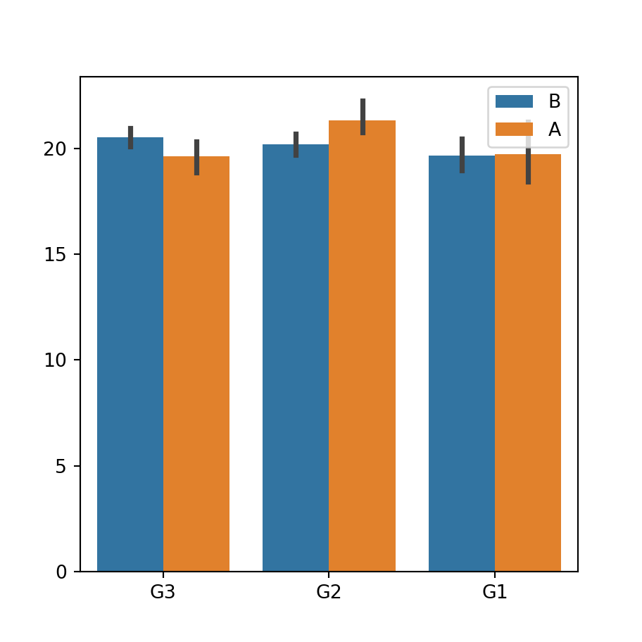
Error bars customization
Remove the error bars
The error bars are displayed over the bars by default, but you can remove them setting the argument ci to False . You can also set this argument to «sd» so the error bars will be calculated using the standard deviation of the data.
import seaborn as sns sns.barplot(x = group, y = variable, ci = None)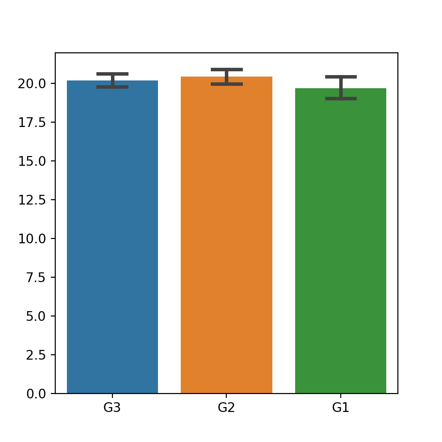
Adding caps to the error bars
If you want to add caps (horizontal segments) to the error bars you can set its width with the capsize argument, as shown below.
import seaborn as sns sns.barplot(x = group, y = variable, capsize = 0.25)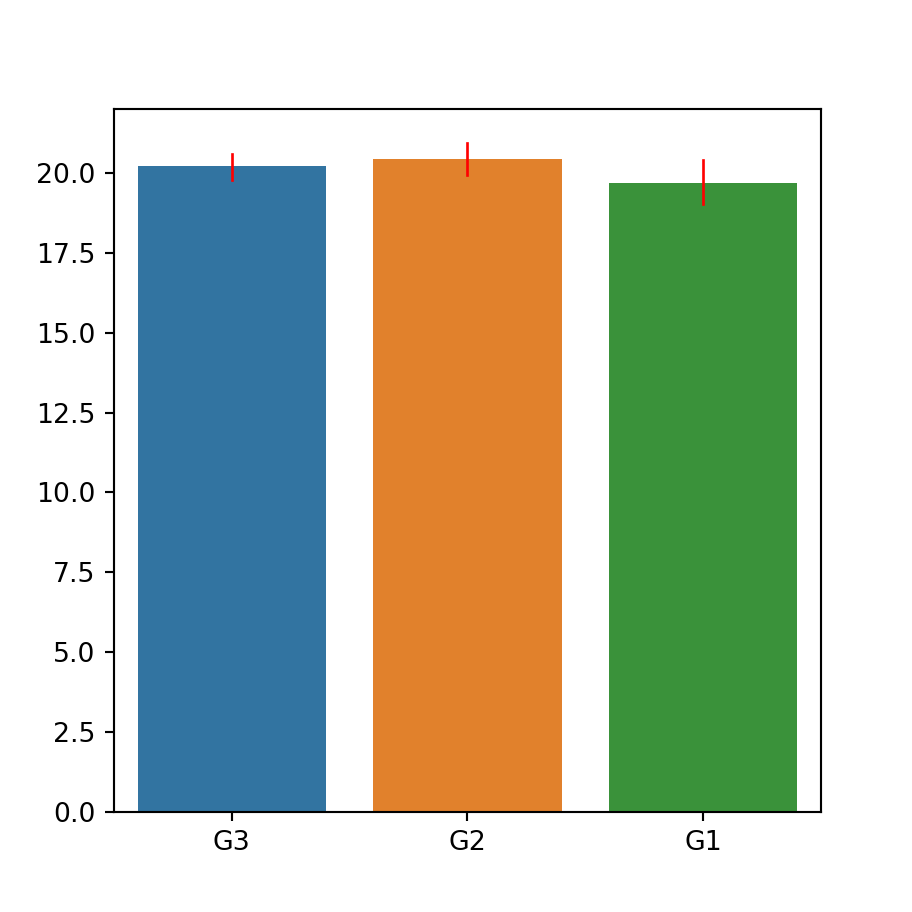
Color and width of the error bars
In addition, it is possible to change the width and the color of the error bars with errwidth and errcolor , respectively.
import seaborn as sns sns.barplot(x = group, y = variable, errwidth = 1, errcolor = "red")Color customization
Same color for all bars
If you want to set the same color for all the bars choose a color with the color argument. Recall that you can change its saturation with the saturation argument.
import seaborn as sns sns.barplot(x = group, y = variable, color = "darkseagreen", saturation = 0.75)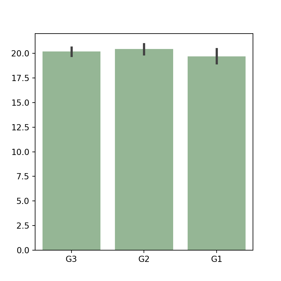
Color palette
An alternative is selecting a named color palette or passing a dictionary with a color for each group to the palette argument of the function.
import seaborn as sns sns.barplot(x = group, y = variable, palette = "Blues_d")
Further customization
Finally, it should be noted that there are other arguments to customize the styling of the plot, as edgecolor , to change the borders color, among others.
import seaborn as sns sns.barplot(x = group, y = variable, linewidth = 1, facecolor = "white", edgecolor = "red")