text-overflow
Определяет параметры видимости текста в блоке, если текст целиком не помещается в заданную область. Возможны два варианта: текст обрезается; текст обрезается и к концу строки добавляется многоточие. text-overflow работает в том случае, если для блока значение свойства overflow установлено как auto , scroll или hidden .
Краткая информация
Синтаксис
text-overflow: clip | ellipsisСинтаксис
| Описание | Пример | |
|---|---|---|
| Указывает тип значения. | ||
| A && B | Значения должны выводиться в указанном порядке. | && |
| A | B | Указывает, что надо выбрать только одно значение из предложенных (A или B). | normal | small-caps |
| A || B | Каждое значение может использоваться самостоятельно или совместно с другими в произвольном порядке. | width || count |
| [ ] | Группирует значения. | [ crop || cross ] |
| * | Повторять ноль или больше раз. | [,]* |
| + | Повторять один или больше раз. | + |
| ? | Указанный тип, слово или группа не является обязательным. | inset? |
| Повторять не менее A, но не более B раз. | ||
| # | Повторять один или больше раз через запятую. | # |
Значения
clip Текст обрезается по размеру области. ellipsis Текст обрезается и к концу строки добавляется многоточие.
Пример
Результат данного примера показан на рис. 1.
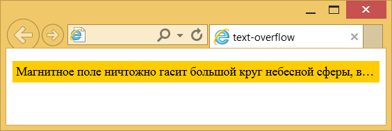
Рис. 1. Многоточие в конце текста
Объектная модель
Объект.style.textOverflow
Примечание
Opera до версии 11 использует свойство -o-text-overflow .
Спецификация
Каждая спецификация проходит несколько стадий одобрения.
- Recommendation ( Рекомендация ) — спецификация одобрена W3C и рекомендована как стандарт.
- Candidate Recommendation ( Возможная рекомендация ) — группа, отвечающая за стандарт, удовлетворена, как он соответствует своим целям, но требуется помощь сообщества разработчиков по реализации стандарта.
- Proposed Recommendation ( Предлагаемая рекомендация ) — на этом этапе документ представлен на рассмотрение Консультативного совета W3C для окончательного утверждения.
- Working Draft ( Рабочий проект ) — более зрелая версия черновика после обсуждения и внесения поправок для рассмотрения сообществом.
- Editor’s draft ( Редакторский черновик ) — черновая версия стандарта после внесения правок редакторами проекта.
- Draft ( Черновик спецификации ) — первая черновая версия стандарта.
Браузеры
В таблице браузеров применяются следующие обозначения.
- — элемент полностью поддерживается браузером;
- — элемент браузером не воспринимается и игнорируется;
- — при работе возможно появление различных ошибок, либо элемент поддерживается с оговорками.
Число указывает версию браузреа, начиная с которой элемент поддерживается.
См. также
Рецепты
Справочник CSS
- !important
- ::after
- ::backdrop
- ::before
- ::first-letter
- ::first-line
- ::placeholder
- ::selection
- :active
- :blank
- :checked
- :default
- :disabled
- :empty
- :enabled
- :first-child
- :first-of-type
- :focus
- :focus-within
- :fullscreen
- :hover
- :in-range
- :indeterminate
- :invalid
- :lang
- :last-child
- :last-of-type
- :link
- :not
- :nth-child
- :nth-last-child
- :nth-last-of-type
- :nth-of-type
- :only-child
- :only-of-type
- :optional
- :out-of-range
- :placeholder-shown
- :read-only
- :read-write
- :required
- :root
- :target
- :valid
- :visited
- @charset
- @document
- @font-face
- @import
- @keyframes
- @media
- @page
- @supports
- @viewport
- accent-color
- align-content
- align-items
- align-self
- all
- animation
- animation-delay
- animation-direction
- animation-duration
- animation-fill-mode
- animation-iteration-count
- animation-name
- animation-play-state
- animation-timing-function
- aspect-ratio
- backdrop-filter
- backface-visibility
- background
- background-attachment
- background-blend-mode
- background-clip
- background-color
- background-image
- background-origin
- background-position
- background-position-x
- background-position-y
- background-repeat
- background-size
- block-size
- border
- border-bottom
- border-bottom-color
- border-bottom-left-radius
- border-bottom-right-radius
- border-bottom-style
- border-bottom-width
- border-collapse
- border-color
- border-image
- border-left
- border-left-color
- border-left-style
- border-left-width
- border-radius
- border-right
- border-right-color
- border-right-style
- border-right-width
- border-spacing
- border-style
- border-top
- border-top-color
- border-top-left-radius
- border-top-right-radius
- border-top-style
- border-top-width
- border-width
- bottom
- box-decoration-break
- box-shadow
- box-sizing
- caption-side
- caret-color
- clear
- clip
- color
- column-count
- column-fill
- column-gap
- column-rule
- column-rule-color
- column-rule-style
- column-rule-width
- column-span
- column-width
- columns
- content
- counter-increment
- counter-reset
- cursor
- direction
- display
- empty-cells
- filter
- flex
- flex-basis
- flex-direction
- flex-flow
- flex-grow
- flex-shrink
- flex-wrap
- float
- font
- font-family
- font-kerning
- font-size
- font-stretch
- font-style
- font-variant
- font-weight
- height
- hyphens
- image-rendering
- justify-content
- left
- letter-spacing
- line-clamp
- line-height
- list-style
- list-style-image
- list-style-position
- list-style-type
- margin
- margin-bottom
- margin-left
- margin-right
- margin-top
- marks
- max-height
- max-width
- min-height
- min-width
- mix-blend-mode
- object-fit
- opacity
- order
- orphans
- outline
- outline-color
- outline-offset
- outline-style
- outline-width
- overflow
- overflow-x
- overflow-y
- padding
- padding-block
- padding-block-end
- padding-block-start
- padding-bottom
- padding-inline
- padding-inline-end
- padding-inline-start
- padding-left
- padding-right
- padding-top
- page-break-after
- page-break-before
- page-break-inside
- perspective
- perspective-origin
- place-content
- pointer-events
- position
- quotes
- resize
- right
- scroll-behavior
- tab-size
- table-layout
- text-align
- text-align-last
- text-decoration
- text-decoration-color
- text-decoration-line
- text-decoration-skip-ink
- text-decoration-style
- text-emphasis
- text-emphasis-color
- text-emphasis-position
- text-emphasis-style
- text-fill-color
- text-indent
- text-orientation
- text-overflow
- text-shadow
- text-stroke
- text-stroke-color
- text-stroke-width
- text-transform
- top
- transform
- transform-origin
- transform-style
- transition
- transition-delay
- transition-duration
- transition-property
- transition-timing-function
- unicode-bidi
- user-select
- vertical-align
- visibility
- white-space
- widows
- width
- word-break
- word-spacing
- word-wrap
- writing-mode
- z-index
- zoom
text-overflow
Свойство text-overflow определяет параметры видимости текста в блоке, если текст целиком не помещается в заданную область.
Возможны два варианта: текст обрезается; текст обрезается и к концу строки добавляется многоточие. text-overflow работает в том случае, если для блока значение свойства overflow установлено как auto , scroll или hidden .
Демо
Синтаксис
1 2 3 4 5 6 7 8 9 10 11 12 13 14 15 16 17 18 19 20 21
/* Overflow behavior at line end Right end if ltr, left end if rtl */ text-overflow: clip; text-overflow: ellipsis; text-overflow: '…'; text-overflow: fade; text-overflow: fade(10px); text-overflow: fade(5%); /* Overflow behavior at left end | at right end Directionality has no influence */ text-overflow: clip ellipsis; text-overflow: '…' '…'; text-overflow: fade clip; text-overflow: fade(10px) fade(10px); text-overflow: fade(5%) fade(5%); /* Global values */ text-overflow: inherit; text-overflow: initial; text-overflow: unset; Значения
clip Текст обрезается по размеру области. ellipsis Текст обрезается и к концу строки добавляется многоточие.
Значение по-умолчанию: clip
Применяется к блочным элементам
Спецификации
Описание и примеры
1 2 3 4 5 6 7 8 9 10 11 12 13 14 15 16 17 18 19 20 21 22 23
html> head> meta charset="utf-8" /> title>text-overflowtitle> style> p.clip white-space: nowrap; /* Запрещаем перенос строк */ overflow: hidden; /* Обрезаем все, что не помещается в область */ background: #fc0; /* Цвет фона */ padding: 5px; /* Поля вокруг текста */ text-overflow: ellipsis; /* Добавляем многоточие */ > style> head> body> p class="clip"> Магнитное поле ничтожно гасит большой круг небесной сферы, в таком случае эксцентриситеты и наклоны орбит возрастают. p> body> html> CSS text-overflow Property
The text-overflow property specifies how overflowed content that is not displayed should be signaled to the user. It can be clipped, display an ellipsis (. ), or display a custom string.
Both of the following properties are required for text-overflow:
| Default value: | clip |
|---|---|
| Inherited: | no |
| Animatable: | no. Read about animatable |
| Version: | CSS3 |
| JavaScript syntax: | object.style.textOverflow=»ellipsis» Try it |
Browser Support
The numbers in the table specify the first browser version that fully supports the property.
Numbers followed by -o- specify the first version that worked with a prefix.
CSS Syntax
Property Values
| Value | Description | Demo |
|---|---|---|
| clip | Default value. The text is clipped and not accessible | Demo ❯ |
| ellipsis | Render an ellipsis («. «) to represent the clipped text | Demo ❯ |
| string | Render the given string to represent the clipped text | |
| initial | Sets this property to its default value. Read about initial | |
| inherit | Inherits this property from its parent element. Read about inherit |
More Examples
Example
Text-overflow with a hover effect (show entire text on hover):
div.a <
white-space: nowrap;
overflow: hidden;
text-overflow: ellipsis;
>
div.a:hover overflow: visible;
>