Full-Bleed Layout Using CSS Grid
Back in the day, there was a gold-standard website layout that everyone strived to create, but that was notoriously difficult to get right: the Holy Grail layout .
It doesn’t seem like it would be so tricky, right? But this was an era before flexbox existed; our tools for the job were tables and floats, and neither were really up to this task. It was technically possible, but some shenanigans were required.
Once flexbox achieved mainstream browser support, this layout went from «holy grail» to «fountain drink»; it was everywhere, because it offered a great user experience, and was within reach for all developers.
As the web has evolved, I’ve discovered a new aspirational layout. It offers a fantastic user experience, especially for long-form text content like news articles or documentation. But, like its predecessor, it’s been deceptively hard to achieve; most implementations require obscure hacks or counterintuitive tricks.
I recently discovered an elegant solution to this problem using CSS Grid. In this post, we’ll learn how it works!
The tutorial is all about how I built a desktop layout. It should still make sense when viewed on mobile, but you’ll miss out on some of the interactive elements. If you can, I’d recommend checking it out on a computer!
Those paragraphs are so wide! Wikipedia doesn’t constrain the container width at all. This leads to lines that are hundreds of characters in length. It’s hard for our eyes to wrap around when we reach the end of a line. If you’re like me, you wind up using your mouse to assist:
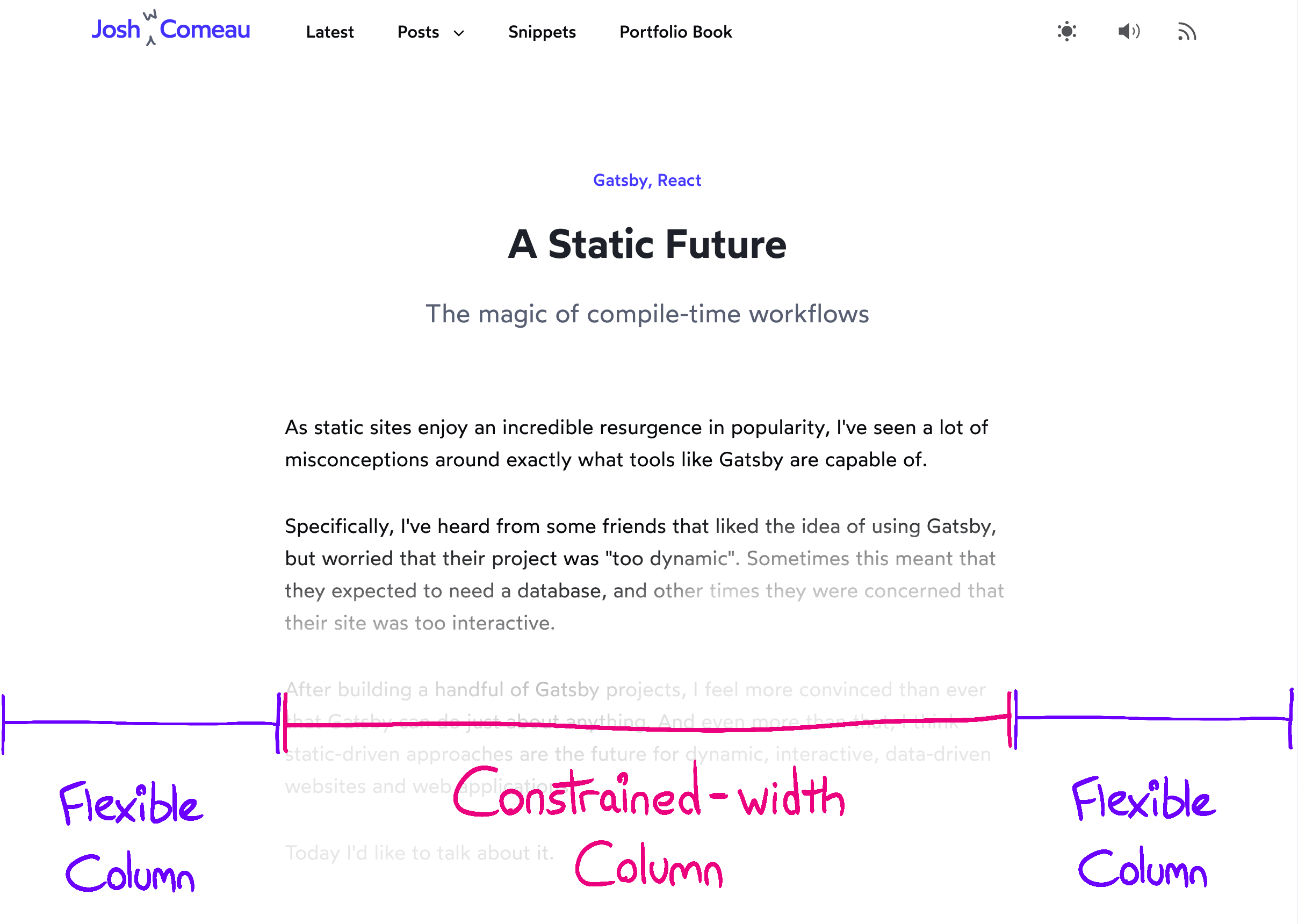
In addition to the line-wrapping concern, it’s just generally hard to read lines of text that are so wide; it fatigues the eye. Research has shown that the ideal line length is about 65 characters. Anywhere between 45 and 85 is generally seen as acceptable, in the context of a roman alphabet. Reading is a complex process, and we should strive to make it as easy as possible. The standard solution to this problem is to create a single fixed-width column in the center of the page. You’ve seen this layout everywhere: online magazines, documentation, news sites, and blogs. You’re looking at it right now, on this site! There’s a complicating factor, however—not all content should be constrained. We should allow images, videos, and custom widgets to break free and fill the available width:

This meerkat used as an example of a child that breaks free of constraints. Photo By Sean Paul Kinnear.
The common term for this kind of thing is “full-bleed”. It’s a term borrowed from the publishing world; when something is printed full-bleed, it extends to the very edge of the paper. This new requirement makes the problem considerably more tricky. It’s relatively easy to constrain all children, but CSS doesn’t really have a mechanism to selectively constrain some children. *
If you’re not familiar with CSS Grid, this might seem like a lot of random characters and keywords. Never fear! All will be explained. grid-template-columns is a property that lets us define the shape of our grid. By providing 3 discrete values, we’re indicating that we want 3 columns. The values define the width of each column. The first column is 1fr , same as the last column. The fr unit is a flexible unit that fills available space. It’s similar in principle to flex-grow ; it’s a ratio of how much of the free space the column should consume. Our center column is a fixed width. We use the min helper to pick whichever value winds up being smaller. On large screens, it will take up 65ch width. On smaller screens, where there isn’t enough horizontal space for 65 characters, it is clamped to 100% of the available container width. (If you use Sass, the min keyword won’t work properly, because it’s already a helper in the preprocessor. View a workaround.) Here’s what this looks like, in practice:
As we’ve discussed, we want to clamp the length of our text so that each line is about 65 characters wide. We can «guestimate» a width using pixels, but CSS has an obscure unit that makes our life a little bit easier: ch
ch is a unit, like px or rem . It corresponds to the width of the 0 character in the current font, for the specified font size. Instead of reverse-engineering a pixel width, we’re specifying a width in characters. In practice, you may still need to do some tinkering; if your font has a particularly narrow 0 character, for example, you’ll need to exaggerate a bit.
We’ve defined a 3-column grid, and now it’s time to assign children to it. By default, children will be slotted into the first available grid cell. We want to override this default behaviour though; all children should sit in the center column, leaving the first and third columns empty.
In CSS Grid, columns are 1-indexed, so 2 is a reference to the middle column. The asterisk ( * ) is a wildcard; it’ll match elements of all types. We’re saying that every child should be assigned to that second middle column. Each new child will create a new row, like so:
You may have heard that using the wildcard selector ( * ) is bad practice. Some will tell you that it is slow, and can affect the overall performance of your page. Happily, this is not true. It’s been debunked again and again. Even in 2009, when computers were slower and browsers were less optimized, this wasn’t an issue. Performance concerns around the wildcard selector are a particularly-resilient urban legend.
We’ve seen how our grid can constrain elements of all types, but what about when we want a child to break free and fill the available width? That’s where this fella comes in:
This special .full-bleed class allows a specific child to bust out of that column, and span all 3 columns. 1 / 4 is a start/end syntax; we’re saying the element should start on Column 1 (inclusive) and span all the way to Column 4 (exclusive).
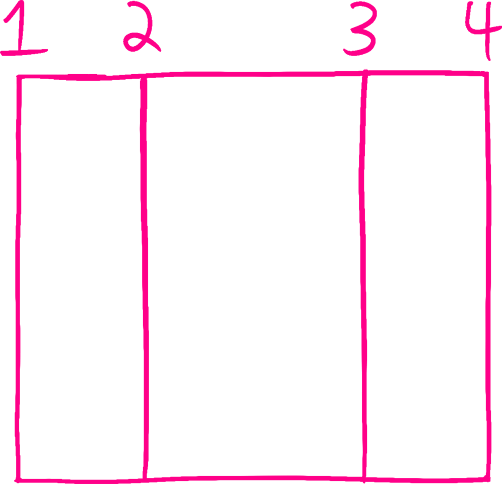
You may be wondering; our grid has 3 columns, so why are we referencing a 4 in 1 / 4 ? In fact, grid columns are indexed by the lines, not the cells. Imagine drawing out a 3-column grid: When we say that our full-bleed class should span from columns 1 through 4, we’re saying it should start right after the first line, and end right before the fourth.
By changing 4 to -1 , we’re counting from the end instead of from the start. We’re saying that our grid should start after the first line, and end before the last. If you are familiar with javascript’s .slice operator, it works in a similar fashion; arr.slice(-1) grabs the last item, since negative numbers mean it should count from the right instead of the left.
The trick is that each child becomes its own grid row, and each child can fill as much of that row as it wants. Most elements will only ever occupy that center column, but some will instead span all 3.
On smaller screen-sizes, we want to add a bit of padding, so that our text isn’t right at the edge of the display. We can accomplish this in a number of ways, including straight-up using padding ! But since this is an article about CSS Grid, let’s check out the grid-based solution:
grid-column-gap is a nifty property which lets us add gutters between columns. In this case, I’ve hardcoded a value of 32px. This introduces a problem, though; because of this extra space, we’ll wind up with the dreaded horizontal scrollbar on mobile 😡 The reason is that gaps are outside columns. We’re telling our column to consume 100% of the available width, and we’re saying that the column should have 32px of space on each side of it. If our device has a 500px-wide screen, we’ll wind up rendering 564px worth of stuff (500px column + 32px per side). We can solve this problem with an absolutely magical CSS property, calc . calc lets us mix units of different types. In this case, what we want is to clamp our center column to be 64px shorter than the full width. We can derive this value with calc(100% — 64px) . This will become our new minimum width for mobile devices.
CSS Grid is super powerful, and now that it’s achieved wide browser support, it can solve so many of our problems!
Some readers have suggested that the same effect could be accomplished with flexbox, or without the use of a wrapper at all. Unfortunately, there are some trade-offs that make those alternatives unworkable. It’s beyond the scope of this article, but I wrote up a couple points in this HackerNews comment.
The historical solution to this problem uses negative margins. It works perfectly well, but it feels a bit hacky to me. You can read more about that solution on CSS Tricks.
One more thing: don’t be afraid to tweak these styles! This recipe is meant to be used as a starting point. For example, you may wish to apply a max-width to the container, to constrain the full-bleed children on ultra-wide monitors. There’s all sorts of fun stuff you can do beyond what’s covered in this tutorial; you can learn more about them in my CSS course!
A front-end web development newsletter that sparks joy
My goal with this blog is to create helpful content for front-end web devs, and my newsletter is no different! I’ll let you know when I publish new content, and I’ll even share exclusive newsletter-only content now and then.
No spam, unsubscribe at any time.
Полное визуальное руководство/шпаргалка по CSS Grid

Сегодня мы с вами рассмотрим свойства CSS Grid (далее также — Грид), позволяющие создавать адаптивные или отзывчивые макеты веб-страниц. Я постараюсь кратко, но полно объяснить, как работает каждое свойство.
Что такое CSS Grid ?

Грид — это макет для сайта (его схема, проект).
Грид-модель позволяет размещать контент сайта (располагать его определенным образом, позиционировать). Она позволяет создавать структуры, необходимые для обеспечения отзывчивости сайтов на различных устройствах. Это означает, что сайт будет одинаково хорошо смотреться на компьютере, телефоне и планшете.
Вот простой пример макета сайта, созданного с помощью Грида.


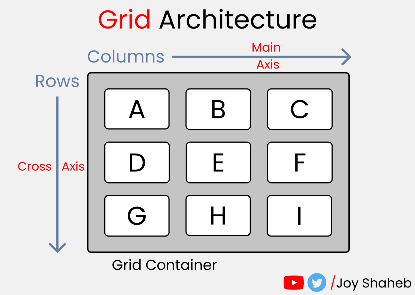
Архитектура CSS Grid
Как же Грид работает? Элементы Грида (grid items) располагаются вдоль главной или основной (main) и поперечной (cross) оси (axis). При помощи различных свойств мы можем манипулировать элементами для создания макетов.
Помимо прочего, у нас имеется возможность объединять строки и колонки подобно тому, как мы это делаем в Excel , что предоставляет нам большую гибкость, чем Флекс ( Flexbox ).
К слову, если вас интересует Флекс, вот соответствующая статья.
Схема CSS Grid

Схема содержит все возможные свойства, предоставляемые Гридом. Эти свойства делятся на:
Обратите внимание: красным цветом отмечены сокращения для свойств:


К концу настоящей статьи у вас будет полное понимание того, как работает каждое из них.
Настройка проекта
Для данного проекта требуются начальные знания HTML , CSS и умение работать с VSCode (или другим редактором по вашему вкусу). Делаем следующее:
- Создаем директорию для проекта, например, Project1 и открываем ее в редакторе ( cd Project1 , code . )
- Создаем файлы index.html и style.css
- Устанавливаем в VSCode сервер для разработки ( Live Server , расширение) и запускаем его
Или вы можете просто открыть Codepen (или любую другую песочницу) и начать писать код.
Все готово, можно приступать к делу.

HTML
Создаем 3 контейнера внутри body :