- CSS Toggle Switch with Text
- CSS Toggle Switch
- Adding Text In CSS Toggle Button
- Different Types Toggle Switch with Text
- Example 1: Blink Toggle Switch
- Example 2: Toggle Switch with border
- Example 3: CSS Toggle Switch with Text Sliding
- Example 4: Toggle Switch with Flip Effect
- Example 5: Toggle Switch with Sliding Button
- Conclusion
- 30 Best CSS Toggle Switches 2023
- 1. Spinning Toggle
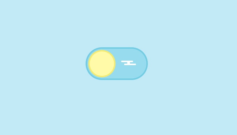
- 2. Sea Mode
- 3. Square To Circle Toggle
- 4. CSS Egg Switch
- 5. 3D 2021 CSS Toggle
- 6. Creating Day Night CSS Toggle Switch
- 7. Neumorphic Toggle Button
- 8. Half Orange Button
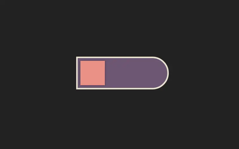
- 9. Pure CSS Fuel Gauge Toggle
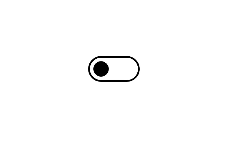
- 10. Toggles
- 11. CSS Plane Switch
- 12. Power Switch Animation
- 13. Toggle Switch Checkbox
- 14. Subscribe Toggle Button
- 15. Toggle Button
- 16. Neumorphism Toggle
- 17. Pure CSS Dark Mode Toggle Switcher
- 18. Checkbox Toggle Animation
- 19. Toggle Radial Effect
- 20. Day Night Toggle
- 21. Checkbox CSS Toggle
- 22. Checkbox Animation With Pure CSS
- 23. Antsy Toggles
- 24. A Confusing Toggle Button
- 25. Toy Toggle Switch
- 26. Volume Toggle CSS Switch
- 27. Checkbox Rocker Toggle Switch
- 28. Gender Toggle Pure CSS
- 29. 3D Toggle
- 30. Light Bulb Toggle Switch
CSS Toggle Switch with Text
In this section, we are going to learn how to create a CSS toggle switch with text. We will learn step by step how to create a toggle button first without any text and then with text. After we learn the basics of a toggle switch button, we will create 10 different toggle switch buttons.
There is no direct way to create a toggle button using HTML tags. We have to use CSS styling to create a toggle switch button.
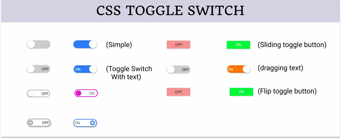
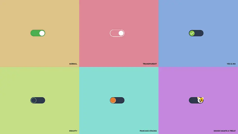
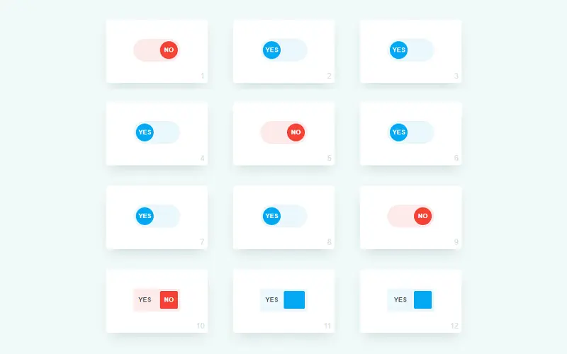
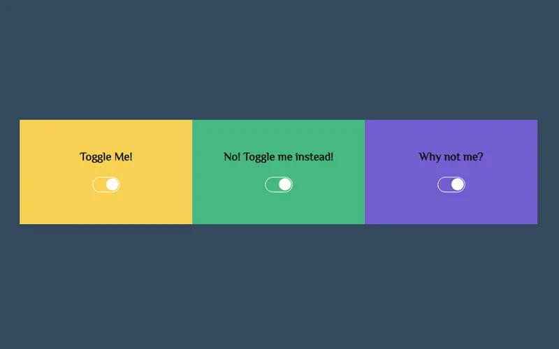
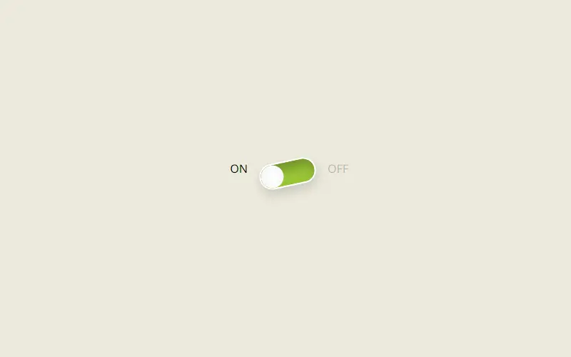
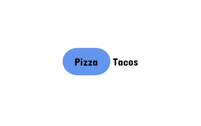
The toggle switch looks like an on and off button that can be checked and unchecked to make it on or off respectively. You can see 10 different toggle switch buttons in the image below.
CSS Toggle Switch
Let’s first start creating a simple toggle switch button to have a good start. If you want a bit more complex toggle button then you can skip this section.
We know there is no direct HTML tag to create a toggle switch button but we can use the checkbox and then modify it using CSS to create a toggle button.
So we create a checkbox using the input element with the type checkbox .
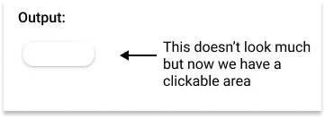
Since the checkbox has a very small clickable area but we need a greater area for the toggle switch so wrap it inside a label tag to increase the clickable area.
Also, add a span tag inside the label to create a slider later using CSS.
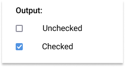
This creates a simple checkbox on the screen.
Now start adding some CSS to make it look like a toggle button.
First, grab the label element and give it width , height , position , background color , border-radius , etc.
Give it a pointer cursor using cursor: pointer to make it look like a clickable area and also hide the checkbox.
The width and height of the label element are essential because it creates the actual clickable area of the toggle button.
/* styling lable */ .toggle < --width: 80px; --height: calc(var(--width) / 3); position: relative; display: inline-block; width: var(--width); height: var(--height); box-shadow: 0px 1px 3px rgba(0, 0, 0, 0.3); border-radius: var(--height); cursor: pointer; >/* hiding checkbox */ .toggle input
Note : Use CSS variable to set the width and height of the label element because this way you just need to change dimension only once and the whole toggle button will adjust automatically.
Now create the slider of the toggle button using the span element.
Give it a position of absolute and top and left to align it with the label element.
Give it the width and height of the label element.
Now use the pseudo-class and create a circular slider handle.
/* Creating slider */ .toggle .slider < position: absolute; top: 0; left: 0; width: 100%; height: 100%; border-radius: var(--height); background-color: #ccc; transition: all 0.4s ease-in-out; >.toggle .slider::before < content: ''; position: absolute; top: 0; left: 0; width: calc(var(--height)); height: calc(var(--height)); border-radius: calc(var(--height) / 2); background-color: #fff; box-shadow: 0px 1px 3px rgba(0, 0, 0, 0.3); transition: all 0.4s ease-in-out; > 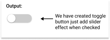
Finally, add the slider effect to the toggle button using the transition property.
/* Adding slider effect */ .toggle input:checked + .slider < background-color: #2196F3; >.toggle input:checked + .slider::before
Here is the complete code:
Example: Simple Toggle Switch Button
.toggle < --width: 80px; --height: calc(var(--width) / 3); position: relative; display: inline-block; width: var(--width); height: var(--height); box-shadow: 0px 1px 3px rgba(0, 0, 0, 0.3); border-radius: var(--height); cursor: pointer; >.toggle input < display: none; >.toggle .slider < position: absolute; top: 0; left: 0; width: 100%; height: 100%; border-radius: var(--height); background-color: #ccc; transition: all 0.4s ease-in-out; >.toggle .slider::before < content: ''; position: absolute; top: 0; left: 0; width: calc(var(--height)); height: calc(var(--height)); border-radius: calc(var(--height) / 2); background-color: #fff; box-shadow: 0px 1px 3px rgba(0, 0, 0, 0.3); transition: all 0.4s ease-in-out; >.toggle input:checked+.slider < background-color: #2196F3; >.toggle input:checked+.slider::before Adding Text In CSS Toggle Button
We created the above toggle button without any text. Let’s move a step forward and add text to the toggle button.
To add text to the toggle button, we just need to add another HTML element inside the toggle button and style it using CSS to make it look like a label.
Again use pseudo-class to create labels that shows ON and OFF text depending on the state of the toggle switch.
Set the opacity to 0 for the OFF state and 1 for the ON state when the toggle switch is not checked and reverse for the other state.
/* Adding text in the toggle button */ .toggle .labels < position: absolute; top: 8px; left: 0; width: 100%; height: 100%; font-size: 12px; font-family: sans-serif; transition: all 0.4s ease-in-out; >.toggle .labels::after < content: attr(data-off); position: absolute; right: 5px; color: #4d4d4d; opacity: 1; text-shadow: 1px 1px 2px rgba(0, 0, 0, 0.4); transition: all 0.4s ease-in-out; >.toggle .labels::before < content: attr(data-on); position: absolute; left: 5px; color: #ffffff; opacity: 0; text-shadow: 1px 1px 2px rgba(255, 255, 255, 0.4); transition: all 0.4s ease-in-out; >.toggle input:checked~.labels::after < opacity: 0; >.toggle input:checked~.labels::before
The above code will add text ON and OFF in the toggle button.
The complete code for toggle button with text is:
Example: Toggle Button with Text
.toggle < --width: 80px; --height: calc(var(--width) / 3); position: relative; display: inline-block; width: var(--width); height: var(--height); box-shadow: 0px 1px 3px rgba(0, 0, 0, 0.3); border-radius: var(--height); cursor: pointer; >.toggle input < display: none; >.toggle .slider < position: absolute; top: 0; left: 0; width: 100%; height: 100%; border-radius: var(--height); background-color: #ccc; transition: all 0.4s ease-in-out; >.toggle .slider::before < content: ''; position: absolute; top: 0; left: 0; width: calc(var(--height)); height: calc(var(--height)); border-radius: calc(var(--height) / 2); background-color: #fff; box-shadow: 0px 1px 3px rgba(0, 0, 0, 0.3); transition: all 0.4s ease-in-out; >.toggle input:checked+.slider < background-color: #2196F3; >.toggle input:checked+.slider::before < transform: translateX(calc(var(--width) - var(--height))); >.toggle .labels < position: absolute; top: 8px; left: 0; width: 100%; height: 100%; font-size: 12px; font-family: sans-serif; transition: all 0.4s ease-in-out; >.toggle .labels::after < content: attr(data-off); position: absolute; right: 5px; color: #4d4d4d; opacity: 1; text-shadow: 1px 1px 2px rgba(0, 0, 0, 0.4); transition: all 0.4s ease-in-out; >.toggle .labels::before < content: attr(data-on); position: absolute; left: 5px; color: #ffffff; opacity: 0; text-shadow: 1px 1px 2px rgba(255, 255, 255, 0.4); transition: all 0.4s ease-in-out; >.toggle input:checked~.labels::after < opacity: 0; >.toggle input:checked~.labels::before Different Types Toggle Switch with Text
Let’s now see multiple different types of toggle switch buttons with text.
Example 1: Blink Toggle Switch
Complete code for blink toggle switch with text is:
Example: Blink Toggle Switch
.toggle < --width: 80px; --height: calc(var(--width) / 3); position: relative; display: inline-block; width: var(--width); height: var(--height); border-radius: var(--height); cursor: pointer; >.toggle input < display: none; >.toggle .slider < position: absolute; top: 0; left: 0; width: 100%; height: 100%; border-radius: var(--height); border: 2px solid #aaa; transition: all 0.4s ease-in-out; >.toggle .slider::before < content: ''; position: absolute; top: 1px; left: 2px; width: calc(var(--height)*0.9); height: calc(var(--height)*0.9); border-radius: calc(var(--height) / 2); background-color: #fff; box-shadow: 0px 1px 3px rgba(0, 0, 0, 0.3); transition: all 0.4s ease-in-out; >.toggle input:checked+.slider < border: 2px solid #f321e9; >.toggle input:checked+.slider::before < background-color: #ce67c9; >.toggle .labels < position: absolute; top: 8px; left: 50px; width: 100%; height: 100%; color: #4d4d4d; font-size: 12px; font-family: sans-serif; transition: all 0.4s ease-in-out; >.toggle .labels::after < content: attr(data-off); position: absolute; opacity: 1; text-shadow: 1px 1px 2px rgba(0, 0, 0, 0.4); transition: all 0.4s ease-in-out; >.toggle .labels::before < content: attr(data-on); position: absolute; opacity: 0; text-shadow: 1px 1px 2px rgba(255, 255, 255, 0.4); transition: all 0.4s ease-in-out; >.toggle input:checked~.labels::after < opacity: 0; >.toggle input:checked~.labels::before Example 2: Toggle Switch with border
Complete code for toggle switch with border is:
Example: Toggle Switch with border
.toggle < --width: 80px; --height: calc(var(--width) / 3); position: relative; display: inline-block; width: var(--width); height: var(--height); border-radius: var(--height); cursor: pointer; >.toggle input < display: none; >.toggle .slider < position: absolute; top: 0; left: 0; width: 100%; height: 100%; border-radius: var(--height); border: 2px solid #969696; box-shadow: 2px 2px 5px rgba(0, 0, 0, 0.3); transition: all 0.4s ease-in-out; >.toggle .slider::before < content: ""; position: absolute; top: 2.5px; left: 2px; width: calc(var(--height)*0.6); height: calc(var(--height)*0.6); border-radius: calc(var(--height) / 2); border: 3px solid #969696; background-color: #dbdbdb; box-shadow: 0px 1px 3px rgba(0, 0, 0, 0.3); transition: all 0.4s ease-in-out; >.toggle input:checked+.slider < border-color: #2196F3; >.toggle input:checked+.slider::before < border-color: #2196F3; background-color: #c6e5ff; transform: translateX(calc(var(--width) - var(--height))); >.toggle .labels < position: absolute; top: 8px; left: 0; width: 100%; height: 100%; color: #4d4d4d; font-size: 12px; font-family: sans-serif; transition: all 0.4s ease-in-out; >.toggle .labels::after < content: attr(data-off); position: absolute; right: 5px; opacity: 1; text-shadow: 1px 1px 2px rgba(0, 0, 0, 0.4); transition: all 0.4s ease-in-out; >.toggle .labels::before < content: attr(data-on); position: absolute; left: 5px; opacity: 0; text-shadow: 1px 1px 2px rgba(255, 255, 255, 0.4); transition: all 0.4s ease-in-out; >.toggle input:checked~.labels::after < opacity: 0; >.toggle input:checked~.labels::before Example 3: CSS Toggle Switch with Text Sliding
Complete code for toggle button with sliding text is:
Example: Toggle Switch with Sliding Text
.toggle < --width: 80px; --height: calc(var(--width) / 3); position: relative; display: inline-block; width: var(--width); height: var(--height); box-shadow: 0px 1px 3px rgba(0, 0, 0, 0.3); border-radius: var(--height); cursor: pointer; >.toggle input < display: none; >.toggle .slider < position: absolute; top: 0; left: 0; width: 100%; height: 100%; border-radius: var(--height); background-color: #ccc; transition: all 0.4s ease-in-out; >.toggle .slider::before < content: ""; position: absolute; top: 0; left: 0; width: calc(var(--height)); height: calc(var(--height)); border-radius: calc(var(--height) / 2); background-color: #fff; box-shadow: 0px 1px 3px rgba(0, 0, 0, 0.3); transition: all 0.4s ease-in-out; >.toggle input:checked+.slider < background-color: #f37521; >.toggle input:checked+.slider::before < transform: translateX(calc(var(--width) - var(--height))); >.toggle .labels < position: absolute; top: 8px; left: 0; width: 100%; height: 100%; font-size: 12px; font-family: sans-serif; transition: all 0.4s ease-in-out; overflow: hidden; >.toggle .labels::after < content: attr(data-off); position: absolute; right: 5px; color: #4d4d4d; opacity: 1; text-shadow: 1px 1px 2px rgba(0, 0, 0, 0.4); transition: all 0.4s ease-in-out; >.toggle .labels::before < content: attr(data-on); position: absolute; left: calc(var(--height) - var(--width) + 2px); color: #ffffff; opacity: 0; text-shadow: 1px 1px 2px rgba(255, 255, 255, 0.4); transition: all 0.4s ease-in-out; >.toggle input:checked~.labels::after < opacity: 0; transform: translateX(calc(var(--width) - var(--height))); >.toggle input:checked~.labels::before Example 4: Toggle Switch with Flip Effect
Complete code for toggle button with sliding flip effect is:
Example: Toggle Switch with Flip Effect
.toggle < --width: 80px; --height: calc(var(--width) / 3); position: relative; display: inline-block; width: var(--width); height: var(--height); box-shadow: 0px 1px 3px rgba(0, 0, 0, 0.3); cursor: pointer; >.toggle input < display: none; >.toggle .labels < position: absolute; top: 0; left: 0; width: 100%; height: 100%; font-size: 12px; font-family: sans-serif; transition: all 0.4s ease-in-out; >.toggle .labels::after < content: attr(data-off); position: absolute; display: flex; justify-content: center; align-items: center; top: 0; left: 0; height: 100%; width: 100%; color: #4d4d4d; background-color: #f19999; text-shadow: 1px 1px 2px rgba(0, 0, 0, 0.4); transition: all 0.4s ease-in-out; >.toggle .labels::before < content: attr(data-on); position: absolute; display: flex; justify-content: center; align-items: center; top: 0; left: 0; height: 100%; width: 100%; color: #ffffff; background-color: #4fe132; text-align: center; opacity: 0; text-shadow: 1px 1px 2px rgba(255, 255, 255, 0.4); transition: all 0.4s ease-in-out; >.toggle input:checked~.labels::after < /* flip 180deg */ transform: rotateY(180deg); opacity: 0; >.toggle input:checked~.labels::before Example 5: Toggle Switch with Sliding Button
Complete code for toggle switch with the sliding button is:
Example: Toggle Switch with Sliding Button
.toggle < --width: 80px; --height: calc(var(--width) / 3); position: relative; display: inline-block; width: var(--width); height: var(--height); box-shadow: 0px 1px 3px rgba(0, 0, 0, 0.3); cursor: pointer; >.toggle input < display: none; >.toggle .labels < position: absolute; top: 0; left: 0; width: 100%; height: 100%; font-size: 12px; font-family: sans-serif; transition: all 0.4s ease-in-out; overflow: hidden; >.toggle .labels::after < content: attr(data-off); position: absolute; display: flex; justify-content: center; align-items: center; top: 0; left: 0; height: 100%; width: 100%; color: #4d4d4d; background-color: #f19999; text-shadow: 1px 1px 2px rgba(0, 0, 0, 0.4); transition: all 0.4s ease-in-out; >.toggle .labels::before < content: attr(data-on); position: absolute; display: flex; justify-content: center; align-items: center; top: 0; left: calc(var(--width) * -1); height: 100%; width: 100%; color: #ffffff; background-color: #4fe132; text-align: center; text-shadow: 1px 1px 2px rgba(255, 255, 255, 0.4); transition: all 0.4s ease-in-out; >.toggle input:checked~.labels::after < transform: translateX(var(--width)); >.toggle input:checked~.labels::before Conclusion
HTML does not provide direct support for toggle switches. In this guide we created CSS toggle button with text.
In this article, we have discussed how to create a toggle switch using CSS and also has explored multiple different types of it.
30 Best CSS Toggle Switches 2023

If you’re looking for the perfect way to put a creative CSS toggle switches on your site then you’re at the right place.
While you’re at it, why not add a sleek look to an interesting look? Today we are going to try to create a list of the best CSS toggle switches with animated, simple, elegant and more options.
Below is a link to each demo and code piece. Whether you want to start with your own design or you are looking for a fully finished toggle switches, you have it all. So undoubtedly let’s get to the list.
So undoubtedly let’s get to the list.
1. Spinning Toggle
Spinning Toggle
Made By: Håvard Brynjulfsen
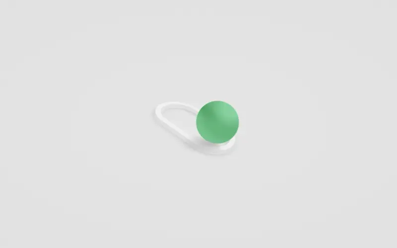
2. Sea Mode

Sea Mode
Made By: Faria Begum Riya
3. Square To Circle Toggle
Square To Circle Toggle
Made By: ItsMeNatalie
4. CSS Egg Switch
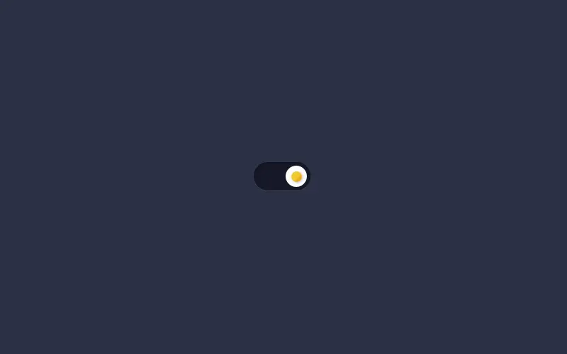
CSS Egg Switch
Made By: Aaron Iker
5. 3D 2021 CSS Toggle

3D 2021 CSS Toggle
Made By: Jhey
6. Creating Day Night CSS Toggle Switch
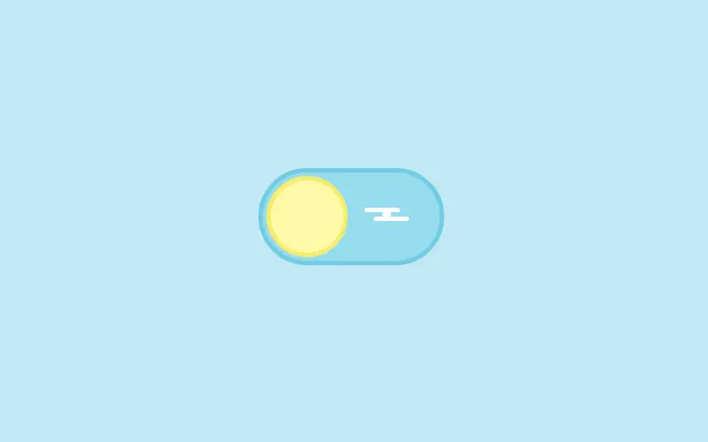
Creating Day Night CSS Toggle Switch
Made By: Chris Bongers
7. Neumorphic Toggle Button
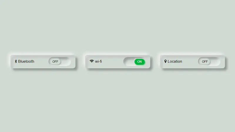
Neumorphic Toggle Button
Made By: somali
8. Half Orange Button

Half Orange Button
Made By: Berke Kir
9. Pure CSS Fuel Gauge Toggle
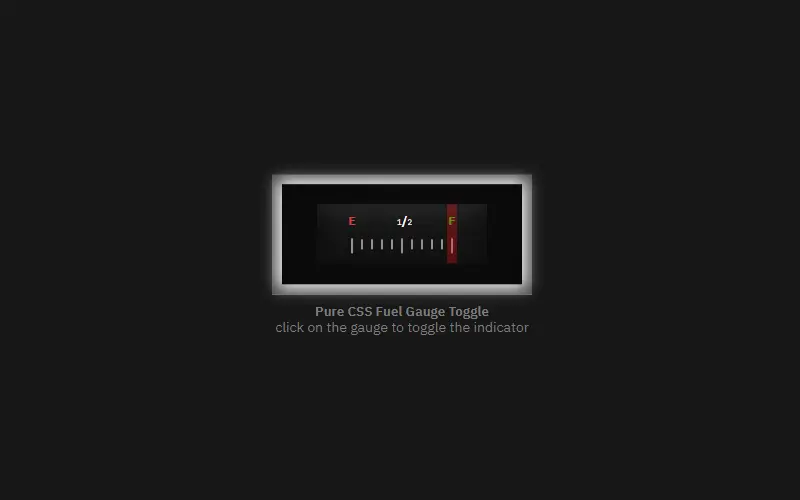
Pure CSS Fuel Gauge Toggle
Made By: Ömercan Balandı
10. Toggles
Toggles
Made By: Olivia Ng
11. CSS Plane Switch
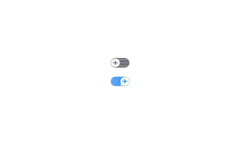
CSS Plane Switch
Made By: Aaron Iker
12. Power Switch Animation

Power Switch Animation
Made By: Milan Raring
13. Toggle Switch Checkbox
Toggle Switch Checkbox
Made By: ItsMeNatalie
14. Subscribe Toggle Button

Subscribe Toggle Button
Made By: Himalaya Singh
15. Toggle Button
Toggle Button
Made By: Navigation bar
16. Neumorphism Toggle
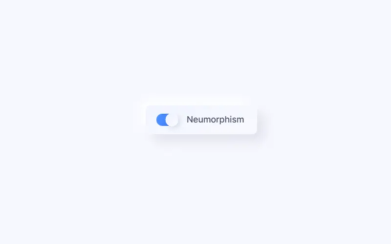
Neumorphism Toggle
Made By: Aaron Iker
17. Pure CSS Dark Mode Toggle Switcher
Pure CSS Dark Mode Toggle Switcher
Made By: Demilade Olaleye
18. Checkbox Toggle Animation
Checkbox Toggle Animation
Made By: @keyframers
19. Toggle Radial Effect
Toggle Radial Effect
Made By: Florin Pop
20. Day Night Toggle

Day Night Toggle
Made By: Ana Tudor
21. Checkbox CSS Toggle

Checkbox CSS Toggle
Made By: Ahmad Emran
22. Checkbox Animation With Pure CSS
Checkbox Animation With Pure CSS
Made By: Erdem Uslu
23. Antsy Toggles
Antsy Toggles
Made By: Daryn St. Pierre
24. A Confusing Toggle Button
A Confusing Toggle Button
Made By: Himalaya Singh
25. Toy Toggle Switch
Toy Toggle Switch
Made By: Jon Kantner
26. Volume Toggle CSS Switch

Volume Toggle CSS Switch
Made By: Aaron Iker
27. Checkbox Rocker Toggle Switch
Checkbox Rocker Toggle Switch
Made By: Marcus Connor
28. Gender Toggle Pure CSS
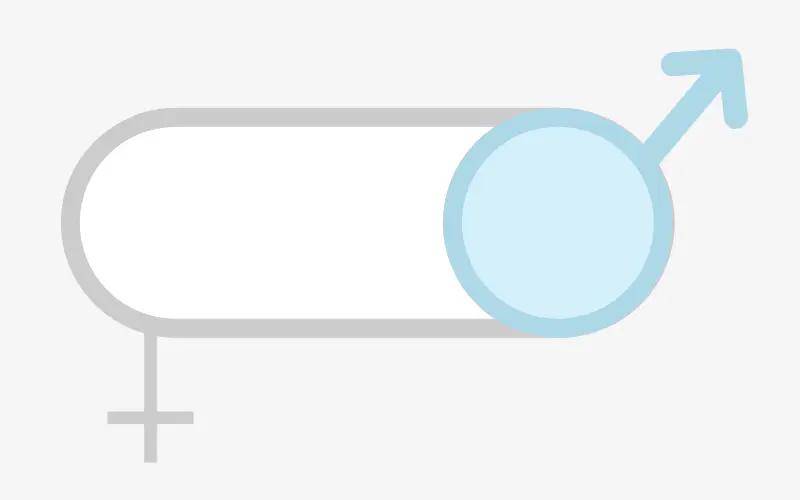
Gender Toggle Pure CSS
Made By: Chintu Yadav Sara
29. 3D Toggle
3D Toggle
Made By: Ana Tudor
30. Light Bulb Toggle Switch
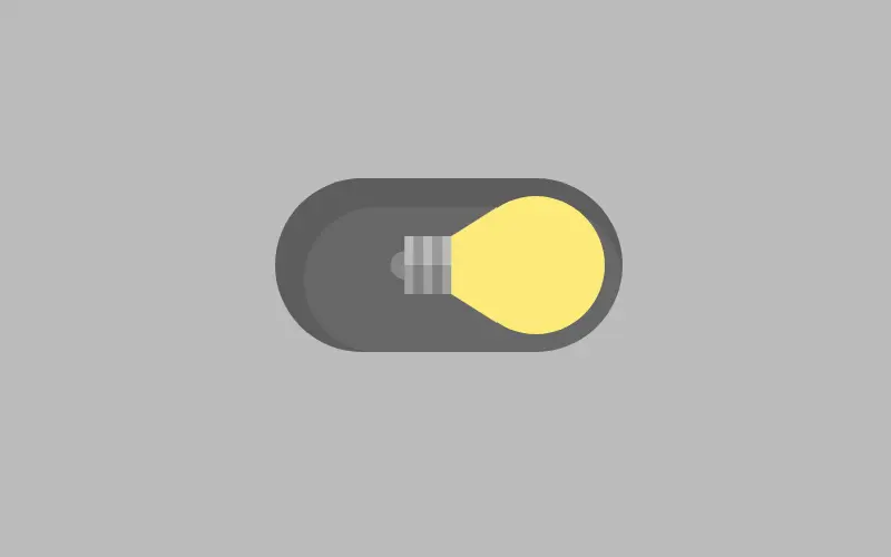
Light Bulb Toggle Switch
Made By: Jon Kantner