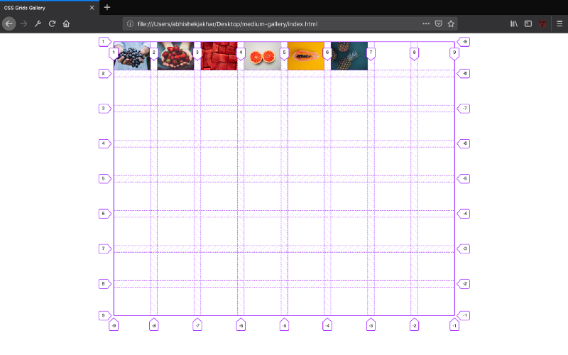
Image galleries made by websites like Unsplash, Pinterest Etc, are made by techniques like positioning or translating the image item which is a very cumbersome task to do. You can achieve the same functionality very quickly using CSS Grids.
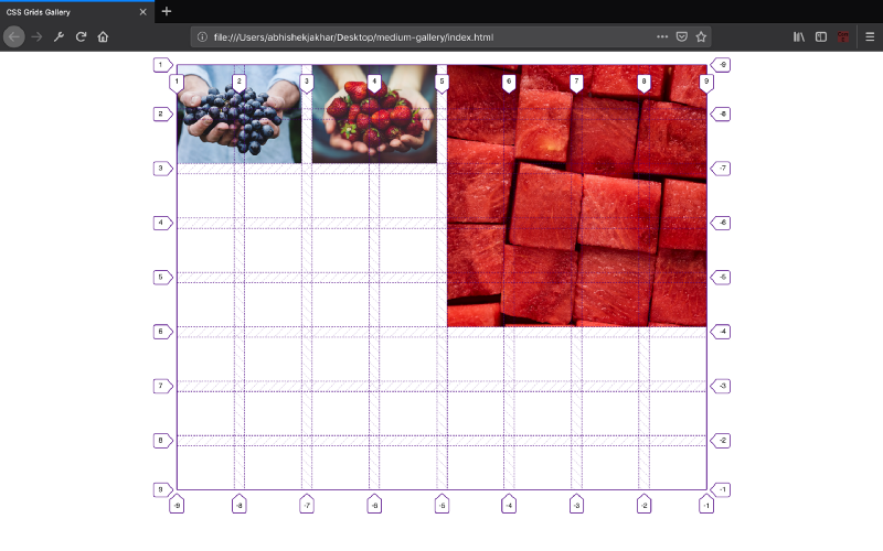
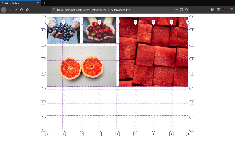
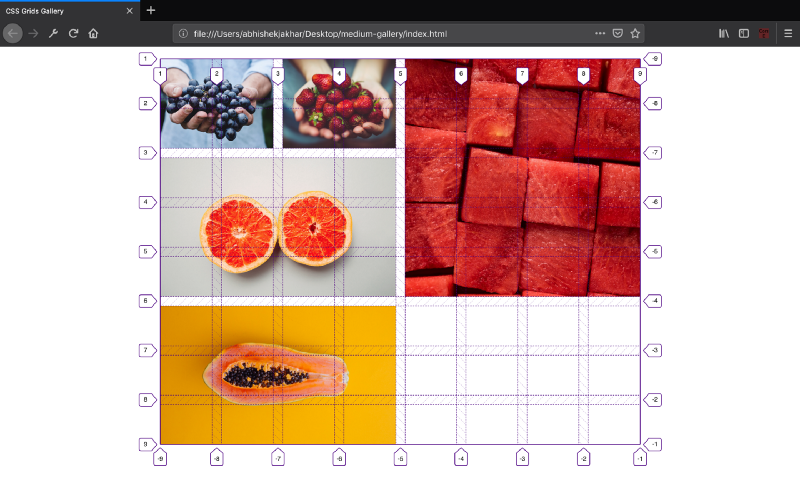
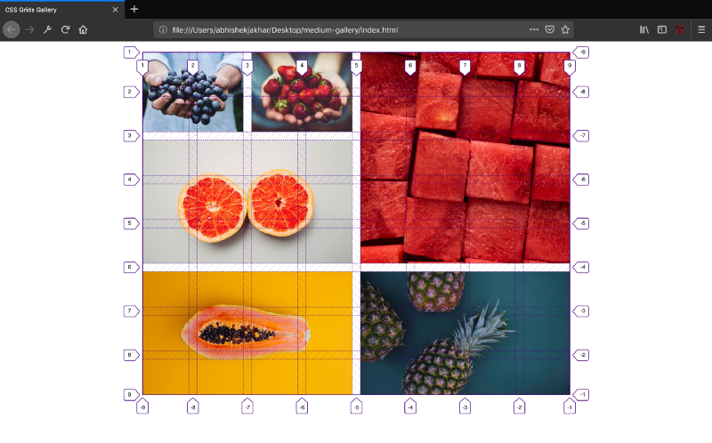
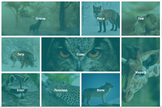
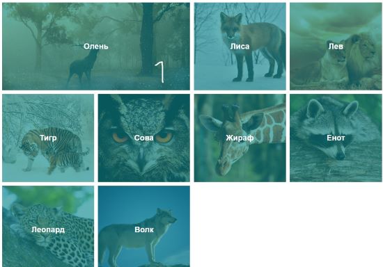
For example: Above is a gallery of images with images of varying width and height which is a perfect use case for CSS grids.
Let’s get started!
The Underlying Grid
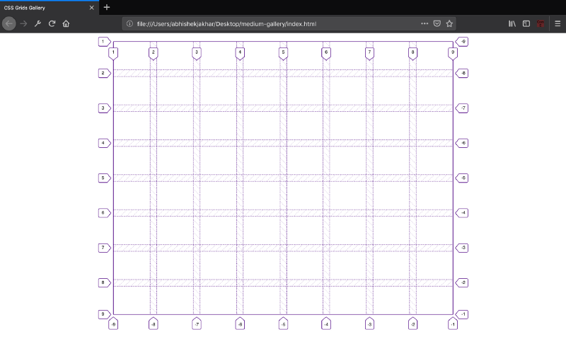
Now, let’s create an 8×8 grid. We can create a grid of other sizes also but that depends on the type of gallery you want. In our case, an 8×8 grid will be ideal.
A grid container is defined by setting an element’s display property to the grid. So, the div, with the class grid is going to be our gridcontainer.
We use the grid-template-columns property to set the column tracks and grid-template-rows to set the row tracks. We declare these properties on the grid container. In our example, we will we be making an 8×8 grid container.
grid-gap: It defines the size of the gap between rowsandcolumns in a grid layout. The value for grid gap can be any CSS length unit. In our example, I have given the value of 15px to make our grid lookbetter.
Note:The height of the rows is tied to the viewport width, so that the cells maintain its aspect ratio perfectly fine. We have 8 rows each with the height of 5 viewport width. I experimented with these heights and came to the conclusion that 5% of viewport width is the perfect size for the height. We are doing this by setting the height of the row to 5vw (viewport width).
Note:All direct children of grid automatically become grid items.
Inserting Grid Items
Now, we will be inserting the grid items inside the grid container:
Styling Images
Setting the object fit value to cover is like setting the background size to cover for the background image. We are doing this so the image can fill the height and width of its box (the grid item), maintaining its aspect ratio.
Note:The object fit property only works if we set the width and height properties.
Note:By default the grid items are laid out according to the grid auto placement rules.
Positioning Grid Items
Before we start positioning the grid items, we will study a few basics concepts.
The grid div is the grid container, and all the direct child elements are the grid items. When we defined the grid tracks with grid-template-columns and grid-template-rows, grid providedus numbered lines called the grid lines to use for positioning the items. You can refer to each grid line by a numerical index.
Columns start at one, from left to right by default, and rows also begin at one from top to bottom. It takes two grid lines to make a single column or row, one line on either side, so our 8-column and 8-row grid consist of 9-column lines and 9-row lines.
The vertical lines 1 and 2 determine the start and end points of the first column. Lines 2 and 3 the second column and so on. Similarly, horizontal lines 1 and 2 determine the position of the first row, and lines 2 and 3 the second row and so on. Knowing the above concepts will help you understand how we are going to position items (images) on our grid.
Now, we will use grid line numbers to control how items are placed by applying properties directly to a grid item. We can specify on which line a grid item starts and ends, and how many tracks it should expand.
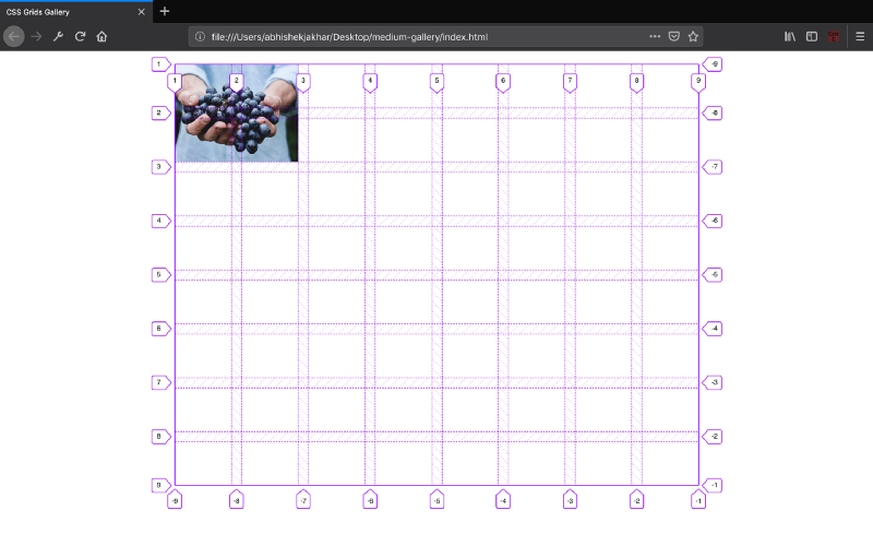
1st Grid Item
So let’s create a new rule that targets the first grid item. We’ll first use the grid-column-start property to indicate the column grid line where the first grid item starts. The grid-column-end indicates where the first grid item ends.
So the grid-column-start value is a number that indicates the grid line at the left edge of a column. The grid-column-end value indicates the grid line that marks the right edge of the column.
So in the example given below, setting grid-column-start to 1 and grid-column-end to 3 means that the grid item will stretch from the left edge of the grid line, line 1 to line 3, filling up 2 columns. We will also use the grid-row-start and grid-row-end properties to indicate the grid item start and end position on the row grid lines in the same way as we did for the column.
После цикла уроков по CSS Grid, пришло время подкрепить полученные знания на верстке реального макета. Мы не будем разбирать все свойства связанные с оформлением, а сфокусируемся именно на верстке одной секции по грид технологии. Как правило начинающие верстальщики легко справляются с CSS свойствами, отвечающими за красоту. Зато испытывают трудности с размещением элементов на сайте и с адаптивностью их под разные разрешения.
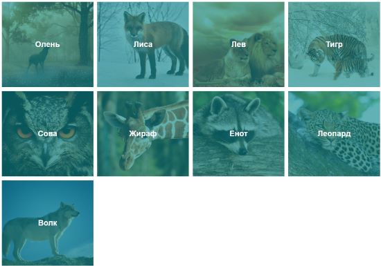
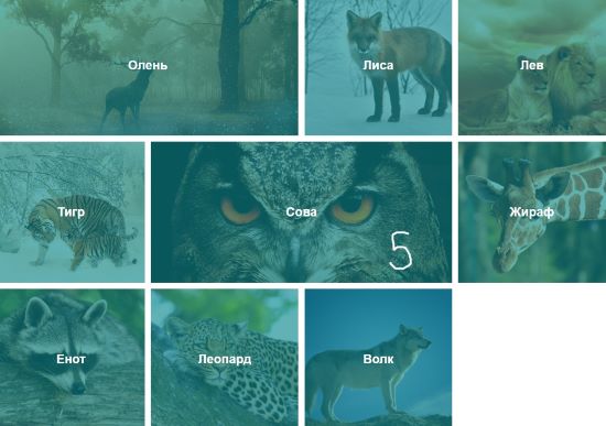
Делать верстку нестандартной фотогалереи (назовем ее портфолио) стало невероятно легко с технологией CSS Grid. В итоге мы должны прийти к такому результату.
HTML разметка
Обратите внимание, что картинки в портфолио не просто так вставлены, а служат фоном для текста. Это значит, что мы не можем вставить картинки средствами HTML, через тег img. Вспоминаем, что у CSS есть свойство background-image. Соответственно, сначала создадим саму секцию-портфолио с вложенными тегами div, а каждую картинку положим в отдельный тег div в качестве фона. Рекомендуется стили касающиеся медиа файлов не выносить в отдельный CSS файл. Медиа файлы должны оставаться в HTML разметке в виде инлайн стилей, если верстка в дальнейшем будет интегрироваться с WordPress или с другой CMS. Иначе пользователю будет неудобно управлять контентом через админ-панель.
HTML код без стилизации, зрелище не для слабонервных. Но не пугайтесь, сейчас стилизуем созданные классы и все быстро нормализуется.
CSS код
Посмотрим на макет и посчитаем сколько элементов находится в одном ряду. Берем по максимальному количеству элементов. В последнем ряду у нас находится 4 элемента. Следовательно, сетка состоит из четырех колонок по одной фракции в каждой.
// Grid контейнер .portfolio-section display: grid; / * отобразить элементы как гриды * / margin: 10px; / * отступы по краям * / grid-template-columns: repeat(4, 1fr); / * шаблон для колонок * / grid-gap: 10px; / * отступы между ячейками * / >
Сделаем базовую разметку для грид элементов.
.portfolio-item display: grid; / * включение гридов для центрирования текста * / min-height: 32vh; / * высота портфолио занимает один экран * / background-size: cover; / * растянуть картинку на весь блок * / background-position: center; / * расположение картинки в центре блока * / text-align: center; / * горизонтальное выравнивание текста * / align-content: center; / * вертикальное выравнивание текста * / >
На данном этапе наша сетка выглядит вот таким образом. Осталось поработать с грид-элементами, которые занимают больше чем одну колонку или ряд.
Мы видим, что первый элемент занимает 2 колонки. Обратимся к первому элементу через псевдокласс nth-child(1) и пропишем шаблон, где 1/3 обозначает с с 1-ой по 3-ю линию.
.portfolio-item:nth-child(1) grid-column: 1/3; / * 1-ый элемент занимает две горизонтальных ячейки * / >
Пятый элемент начинается на 2-ой позиции и заканчивается на четвертой.
.portfolio-item:nth-child(5) grid-column: 2/4; / * 5-ый элемент занимает две горизонтальных ячейки * / >
Шестой элемент занимает четвертую колонку, но его нужно растянуть вертикально.
.portfolio-item:nth-child(6) grid-column: 4; grid-row: 2/4; / * 6-ый элемент занимает две вертикальные ячейки * / >
Создано 12.03.2021 10:07:26
Михаил Русаков
Копирование материалов разрешается только с указанием автора (Михаил Русаков) и индексируемой прямой ссылкой на сайт (http://myrusakov.ru)!
Добавляйтесь ко мне в друзья ВКонтакте: http://vk.com/myrusakov. Если Вы хотите дать оценку мне и моей работе, то напишите её в моей группе: http://vk.com/rusakovmy.
Если Вы не хотите пропустить новые материалы на сайте, то Вы можете подписаться на обновления: Подписаться на обновления
Если у Вас остались какие-либо вопросы, либо у Вас есть желание высказаться по поводу этой статьи, то Вы можете оставить свой комментарий внизу страницы.
Порекомендуйте эту статью друзьям:
Если Вам понравился сайт, то разместите ссылку на него (у себя на сайте, на форуме, в контакте):
Кнопка: Она выглядит вот так:
Текстовая ссылка: Она выглядит вот так: Как создать свой сайт
BB-код ссылки для форумов (например, можете поставить её в подписи):
Комментарии ( 0 ):
Для добавления комментариев надо войти в систему. Если Вы ещё не зарегистрированы на сайте, то сначала зарегистрируйтесь.


