- Исследование высоты BODY
- Настройки браузера по умолчанию. Отступы.
- Высота BODY в пикселях
- Высота BODY в процентах
- CSS, что получилось
- Ссылки
- HTML vs Body: How to Set Width and Height for Full Page Size
- Does It Matter?
- Why Does This Happen?
- And The Problem May Be Hidden
- Reverse-inheritance?
- So What is the Ideal Height Setting for a Full Responsive Page?
- The Modern Solution is Simplified
- Page Height May Cause a Horizontal Scrollbar
- So What is the Fix?
- How to Set the Page for Full Width
- How to Set Width to Your Preference
- Conclusion
Исследование высоты BODY
Небольшое исследование поведения элемента BODY в различных браузерах. Отступы от границ окна (margin, padding). Высота BODY и ее изменение в зависимости от высоты контента в Internet Explorer 6, Firefox 1.5, Opera 8.
Внимание: это очень старый, но актуальный пост, оставлю его здесь в честь памяти сайту html.ru, который более не доступен.
Для исследования возьму минимальный XHTML -документ:
Определение типа документа: XHTML 1.1. IE6, FF1.5, Opera8 отображают этот документ в режиме соответствия стандартам (Standards mode). К этому документу подключена таблица стилей для определения фона страницы и цвета текста.
В теле документа один блочный элемент DIV . Для начала определю ему цвет фона, отличный от установленного для BODY .
Теперь этот DIV виден в окне браузера.
Настройки браузера по умолчанию. Отступы.
В окне браузера наблюдаются отступы от границ окна до границ элемента DIV .
На рисунке здесь и далее красной линией показана верхняя граница видимой части окна трех различных браузеров.
- IE 6 — сверху: 15px, справа: 10px, снизу: неизвестно, слева: 10px;
- FF 1.5 — сверху: 8px, справа: 8px, снизу: неизвестно, слева: 8px;
- Opera 8 — сверху: 8px, справа: 8px, снизу: неизвестно, слева: 8px;
Добавлю фон для всего документа:
Теперь разница более заметна: вокруг DIV в Opera белая рамка шириной 8px (судя по цвету, это BODY ), а в IE и FF размеры отступов остались прежними, но приобрели цвет фона всего документа (похоже, BODY не больше DIV ).
В IE и FF отступы исчезли, DIV вплотную прижат к верхней, правой и левой границам окна, в то время, как в Opera ничего не изменилось.
А теперь заменю в CSS установленный для BODY margin на padding :
Предположения подтвердились. Отступы в IE и FF — margin элемента BODY , а в Opera — padding .
Оставлю для дальнейшего исследования у BODY :
Вывод: эти отступы различны в упомянутых браузерах не только по размерам, но и по сути. BODY по умолчанию занимает не все окно, его высота зависит от содержимого.
Высота BODY в пикселях
Установлю в CSS высоту BODY в пикселях, например, height: 200рх . Для продолжения экспериментов уменьшаю ширину элемента DIV до width: 50% и центрирую его по горизонтали с помощью margin: 0 auto .
На рисунке можно увидеть, что получилось. Теперь можно наблюдать за BODY и DIV одновременно.
Если теперь увеличить высоту DIV , пока она меньше или равна высоте BODY ничего интересного не происходит. Если высота DIV будет установлена 100%, все три браузера посчитают ее относительно высоты BODY .
Различия появляются когда указываемая мной высота DIV станет больше высоты BODY .
Если теперь убрать из CSS высоту BODY , все встает на свои места. Высота BODY становится равной высоте размещенного в нем DIV во всех трех браузерах.
Высота BODY в процентах
Установлю для body < height:100% >. И снова браузеры по разному это показывают. В FF и Opera ничего и не произошло, тогда как IE растянул BODY на всю высоту видимой части окна.
Добавлю для html < height:100% >. Теперь во всех трех браузерах одинаково. Казалось бы, на этом можно остановиться.
Но я сделаю высоту DIV несколько больше высоты видимой области окна браузера. Появился вертикальный скроллинг. Внизу страницы видно следующее:
IE снова растянул BODY до высоты содержимого, а FF и Opera оставили его высоту 100% от видимой части страницы.
Заменяю height: 100% для BODY на min-height: 100%; и ситуация меняется на противоположную.
Теперь FF и Opera при минимальной высоте DIV растягивают BODY до высоты видимой части окна, а при увеличении контента и появлении вертикального скроллинга — до высоты содержимого.
IE6 не знает о свойстве min-height , поэтому высота BODY в обоих случаях равна высоте содержимого, т.е. DIV .
Добавляю height: 100% для BODY . FF и Opera снова растягивают его до 100% высоты видимой части страницы и не более того.
А IE растягивает BODY до 100% высоты видимой части страницы при минимальной высоте DIV , а при ее превышении видимой области окна браузера — до высоты содержимого.
Теперь добавляю height: auto !important; для BODY и таким образом, поведение его высоты во всех трех браузерах, участвующих в исследовании, становится одинаковым.
Выводы: HTML всегда занимает всю высоту окна браузера. Для управления высотой содержимого следует определить высоту HTML в CSS height: 100% . IE игнорирует правило !important и свойство min-height , поэтому для него работает height: 100% , тогда как height: auto !important маскирует в FF и Opera height: 100% .
CSS, что получилось
Для достижения результата, представленного на последнем рисунке, CSS будет, например таким:
Здесь я оставил только свойства для разметки страницы.
BODY при небольшом количестве контента будет занимать 100% высоты видимой части окна браузера.
Когда контента будет много и появится вертикальный скроллинг, высота BODY будет равна высоте содержимого.
Ссылки
HTML vs Body: How to Set Width and Height for Full Page Size

Dave Gray

CSS is difficult but also forgiving. And this forgiveness allows us to haphazardly throw styles into our CSS.
Our page still loads. There is no «crash».
When it comes to page width and height, do you know what to set on the HTML element? How about the body element?
Do you just slap the styles into both elements and hope for the best?
If you do, you’re not alone.
The answers to those questions are not intuitive.
I’m 100% guilty of applying styles to both elements in the past without considering exactly which property should be applied to which element. 🤦♂️
It is not uncommon to see CSS properties applied to both the HTML and body elements like this:
Does It Matter?
The above style definition creates a problem:
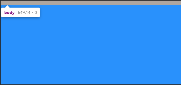
Setting min-height to 100% on both elements does not allow the body element to fill the page like you might expect. If you check the computed style values in dev tools, the body element has a height of zero.
Meanwhile, the HTML element has a height equal to the visible part of the page in the browser.
Look at the following screenshot from Chrome Dev Tools:
Why Does This Happen?
Using a percentage as a size value requires the element to reference a parent to base that percentage on.
The HTML element references the viewport which has a height value equal to the visible viewport height. However, we only set a min-height on the HTML element. NOT a height property value.
Therefore, the body element has no parent height value to reference when deciding what 100% is equal to.
And The Problem May Be Hidden
If you started out with enough content to fill the body of the page, you might not have noticed this issue.
And to make it more difficult to notice, if you set a background-color on both elements or even on just one of them, the viewport is full of that color. This gives the impression the body element is as tall as the viewport.
It’s not. It’s still at zero.
The image above is taken from a page with the following CSS:
Reverse-inheritance?
In a strange twist, the HTML element assumes the background-color of the body element if you don’t set a separate background-color on the html element.
So What is the Ideal Height Setting for a Full Responsive Page?
For years, the answer was the following:
This allows the HTML element to reference the parent viewport and have a height value equal to 100% of the viewport value.
With the HTML element receiving a height value, the min-height value assigned to the body element gives it an initial height that matches the HTML element.
This also allows the body to to grow taller if the content outgrows the visible page.
The only drawback is the HTML element does not grow beyond the height of the visible viewport. However, allowing the body element to outgrow the HTML element has been considered acceptable.
The Modern Solution is Simplified
This example uses vh (viewport height) units to allow the body to set a minimum height value based upon the full height of the viewport.
Like the previously discussed background-color, if we do not set a height value for the HTML element, it will assume the same value for height that is given to the body element.
Therefore, this solution avoids the HTML element overflow present in the previous solution and both elements grow with your content!
The use of vh units did cause some mobile browser issues in the past, but it appears that Chrome and Safari are consistent with viewport units now.
Page Height May Cause a Horizontal Scrollbar
Shouldn’t this say «Page Width»?
In another strange series of events, your page height may activate the horizontal scrollbar in your browser.
When your page content grows taller than the viewport height, the vertical scrollbar on the right is activated. This can cause your page to instantly have a horizontal scrollbar as well.
So What is the Fix?
You may sleep better knowing it starts with a page width setting.
This problem arises when any element — not just the HTML or body element — is set to 100vw (viewport width) units.
The viewport units do not account for the approximate 10 pixels that the vertical scrollbar takes up.
Therefore, when the vertical scrollbar activates you also get a horizontal scrollbar.
How to Set the Page for Full Width
Not setting a width on the HTML and body elements will default to the full size of the screen. If you do set a width value other than auto, consider utilizing a CSS reset first.
Remember, by default the body element has 8px of margin on all sides.
A CSS reset removes this. Otherwise, setting the width to 100% before removing the margins will cause the body element to overflow. Here’s the CSS reset I use:
How to Set Width to Your Preference
While it may not always be necessary to set a width, I usually do.
If you set the width to 100% on the body element you will have a full page width. This is essentially equivalent to not setting a width value and allowing the default.
If you want to use the body element as a smaller container and let the HTML element fill the page, you could set a max-width value on the body.
Conclusion
With no height value provided for the HTML element, setting the height and/or min-height of the body element to 100% results in no height (before you add content).
However, with no width value provided for the HTML element, setting the width of the body element to 100% results in full page width.
This can be counterintuitive and confusing.
For a responsive full page height, set the body element min-height to 100vh.
If you set a page width, choose 100% over 100vw to avoid surprise horizontal scrollbars.
I’ll leave you with a tutorial from my YouTube channel demonstrating the CSS height and width settings for an HTML page that is full screen size and grows with the content it contains:
Do you have a different way of setting the CSS width and height that you prefer?